


Monthly Archives: September 2020
JavaScript/CSS/HTML || Modal.js – Simple Modal Dialog Prompt Using Vanilla JavaScript
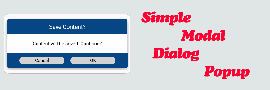
The following is a module which allows for a simple modal popup dialog panel in vanilla JavaScript. This module allows for custom Yes/No prompts.
Options include allowing the modal to be dragged, resized, and closed on outer area click. Modal drag and resize supports touch (mobile) input.
Contents
1. Basic Usage

2. Available Options

3. Alert Dialog

4. Yes/No Dialog

5. Custom Buttons

6. Dialog Instance

7. Modal.js & CSS Source

8. More Examples
1. Basic Usage
Syntax is very straightforward. The following demonstrates adding a simple dialog to the page.
|
1 2 3 4 5 6 7 8 9 10 11 |
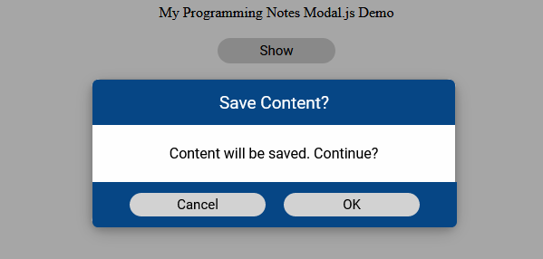
// Add simple dialog. <script> (() => { // Adds a simple dialog to the page Modal.showDialog({ title: 'Save Content?', body: 'Content will be saved. Continue?', }); })(); </script> |
Sample:
The following example demonstrates how to add click events to the default dialog buttons. The ordering of the buttons on initialization defines its placement on the dialog.
|
1 2 3 4 5 6 7 8 9 10 11 12 13 14 15 16 17 18 19 20 21 22 23 |
// Add click events. <script> (() => { // Add click events to the buttons Modal.showDialog({ title: 'Save Content?', body: 'Content will be saved. Continue?', buttons: { cancel: { onClick: (event) => { console.log(`${event.target.innerText} Button Clicked`); } }, ok: { onClick: (event) => { console.log(`${event.target.innerText} Button Clicked`); } } } }); })(); </script> |
2. Available Options
The options supplied to the ‘Modal.showDialog‘ function is an object that is made up of the following properties.
|
1 2 3 4 5 6 7 8 9 10 11 12 13 14 15 16 17 18 19 20 21 22 23 24 25 26 27 28 29 30 31 |
// Available options Modal.showDialog({ title: 'Save Content?', // The title of the dialog body: 'Content will be saved. Continue?', // The content body of the dialog onShow: () => { // Optional. Function that allows to do something before show. Return false to stop showing process console.log(`Dialog is showing`); }, onHide: () => { // Optional. Function that allows to do something before hide. Return false to stop hidding process console.log(`Dialog is hiding`); }, onDestroy: () => { // Optional. Function that allows to do something before destroy. Return false to stop destroying process console.log(`Dialog is destroying`); }, closeOnOuterClick: false, // Optional. Determines if the dialog should close on outer dialog click. Default is False draggable: false, // Optional. Determines if the dialog is draggable. Default is False resizable: false, // Optional. Determines if the dialog is resizable. Default is False autoOpen: true, // Optional. Determines if the dialog should auto open. Default is True destroyOnHide: true, // Optional. Determines if the dialog should be removed from DOM after hiding. Default is True buttons: { // Optional. Allows to add custom buttons to the dialog custom1: { text: 'Custom Button', cssClass: '', visible: true, onClick: (event) => { console.log(`${event.target.innerText} Button Clicked`); } }, // ..... Additional buttons }, }); |
Supplying different options to ‘Modal.showDialog‘ can change its appearance. The following examples below demonstrate this.
3. Alert Dialog
The following example demonstrates an alert dialog.
|
1 2 3 4 5 6 7 8 9 10 11 12 13 14 |
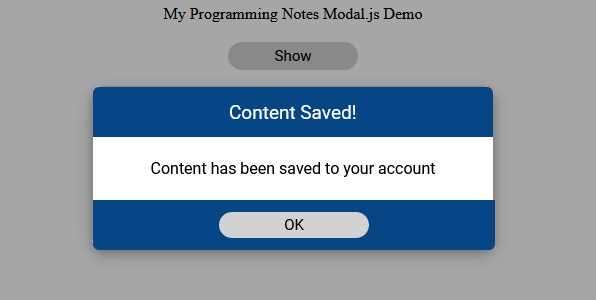
// Alert dialog. <script> (() => { // Alert Modal.showDialog({ title: 'Content Saved!', body: 'Content has been saved to your account', buttons: { ok: {} } }); })(); </script> |
Sample:
4. Yes/No Dialog
The following example demonstrates a yes/no dialog.
|
1 2 3 4 5 6 7 8 9 10 11 12 13 14 15 |
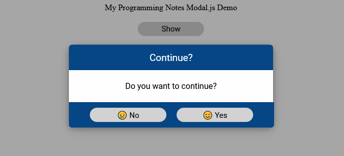
// Yes/No dialog. <script> (() => { // Yes/No Modal.showDialog({ title: 'Continue?', body: 'Do you want to continue?', buttons: { no: {text: '😢 No'}, yes: {text: '😊 Yes'} } }); })(); </script> |
Sample:
5. Custom Buttons
The following example demonstrates multiple custom buttons.
|
1 2 3 4 5 6 7 8 9 10 11 12 13 14 15 16 17 18 19 20 21 22 23 24 25 26 27 28 29 30 31 32 33 34 35 36 37 38 |
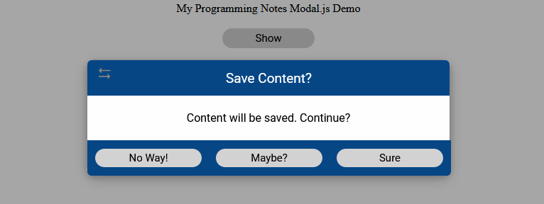
// Custom buttons. <script> (() => { // Custom buttons Modal.showDialog({ title: 'Save Content?', body: 'Content will be saved. Continue?', draggable: true, buttons: { custom1: { text: 'No Way!', cssClass: '', visible: true, onClick: (event) => { console.log(`${event.target.innerText} Button Clicked`); } }, custom2: { text: 'Maybe?', cssClass: '', visible: true, onClick: (event) => { console.log(`${event.target.innerText} Button Clicked`); } }, custom3: { text: 'Sure', cssClass: '', visible: true, onClick: (event) => { console.log(`${event.target.innerText} Button Clicked`); } }, }, }); })(); </script> |
Sample:
6. Dialog Instance
The following example demonstrates how to use the dialog instance to show and hide when needed.
|
1 2 3 4 5 6 7 8 9 10 11 12 13 14 15 16 17 |
// Dialog Instance. <script> (() => { // Create dialog instance and show/hide when needed let dialog = Modal.showDialog({ title: 'Save Content?', body: 'Content will be saved. Continue?', autoOpen: false, }); //dialog.modal // The Javascript modal element dialog.show(); // Shows the modal popup //dialog.hide(); // Hides the modal popup //dialog.destroy(); // Hides the modal popup & removes it from the DOM })(); </script> |
7. Modal.js & CSS Source
8. More Examples
Below are more examples demonstrating the use of ‘Modal.js‘. Don’t forget to include the module when running the examples!
|
1 2 3 4 5 6 7 8 9 10 11 12 13 14 15 16 17 18 19 20 21 22 23 24 25 26 27 28 29 30 31 32 33 34 35 36 37 38 39 40 41 42 43 44 45 46 47 48 49 50 51 52 53 54 55 56 57 58 59 60 61 62 63 64 65 66 67 68 69 70 71 72 73 74 75 76 77 78 79 80 81 82 83 84 85 86 87 88 89 90 91 92 93 94 95 96 97 98 99 100 101 102 103 104 105 106 107 108 109 110 111 112 113 114 115 116 117 118 119 120 121 122 123 124 125 126 127 128 129 130 131 132 |
<!-- // ============================================================================ // Author: Kenneth Perkins // Date: Sept 23, 2020 // Taken From: http://programmingnotes.org/ // File: modalDialog.html // Description: Demonstrates the use of Modal.js // ============================================================================ --> <!DOCTYPE html> <html> <head> <meta charset="utf-8"/> <title>My Programming Notes Modal.js Demo</title> <style> .main { text-align:center; margin-left:auto; margin-right:auto; } .button { padding: 5px; background-color: #d2d2d2; height:100%; text-align:center; text-decoration:none; color:black; display: flex; justify-content: center; align-items: center; flex-direction: column; border-radius: 15px; cursor: pointer; width: 120px; border: none; font-size: 15px; font-family: "Roboto",sans-serif, Marmelad,"Lucida Grande",Arial,"Hiragino Sans GB",Georgia,"Helvetica Neue",Helvetica; } .button:hover { background-color:#bdbdbd; } .inline { display:inline-block; } </style> <!-- // Include module --> <link type="text/css" rel="stylesheet" href="./Modal.css"> <script type="text/javascript" src="./Modal.js"></script> </head> <body> <div class="main"> My Programming Notes Modal.js Demo <div style="margin-top: 20px;"> <div id="btnShow" class="inline button"> Show </div> </div> </div> <script> document.addEventListener("DOMContentLoaded", function(eventLoaded) { // Custom buttons let dialog = Modal.showDialog({ title: 'Save Content?', // The title of the dialog body: 'Content will be saved. Continue?', // The content body of the dialog onShow: () => { // Optional. Function that allows to do something before show. Return false to stop showing process console.log(`Dialog ${dialog.modal.id} is showing`); }, onHide: () => { // Optional. Function that allows to do something before hide. Return false to stop hidding process console.log(`Dialog ${dialog.modal.id} is hiding`); }, onDestroy: () => { // Optional. Function that allows to do something before destroy. Return false to stop destroying process console.log(`Dialog ${dialog.modal.id} is destroying`); }, closeOnOuterClick: false, // Optional. Determines if the dialog should close on outer dialog click. Default is False draggable: true, // Optional. Determines if the dialog is draggable. Default is False resizable: false, // Optional. Determines if the dialog is resizable. Default is False autoOpen: false, // Optional. Determines if the dialog should auto open. Default is True destroyOnHide: false, // Optional. Determines if the dialog should be removed from DOM after hiding. Default is True buttons: { // Optional. Allows to add custom buttons to the dialog custom1: { text: 'No Way!', cssClass: '', visible: true, onClick: (event) => { console.log(`${event.target.innerText} Button Clicked`); } }, custom2: { text: 'Maybe?', cssClass: '', visible: true, onClick: (event) => { console.log(`${event.target.innerText} Button Clicked`); } }, custom3: { text: 'Sure', cssClass: '', visible: true, onClick: (event) => { console.log(`${event.target.innerText} Button Clicked`); } }, }, }); setTimeout(() => { //dialog.modal // The Javascript modal element dialog.show(); // Shows the modal popup setTimeout(() => { dialog.hide(); // Hides the modal popup //dialog.destroy(); // Hides the modal popup & removes it from the DOM }, 2000); }, 200); // Show the modal document.querySelector('#btnShow').addEventListener('click', (event) => { dialog.show() }); }); </script> </body> </html><!-- // http://programmingnotes.org/ --> |
QUICK NOTES:
The highlighted lines are sections of interest to look out for.
The code is heavily commented, so no further insight is necessary. If you have any questions, feel free to leave a comment below.
JavaScript || How To Get The Minimum & Maximum Values In A Simple & Object Array

The following is a module with functions which demonstrates how to get the minimum and maximum values in a simple and object array.
The functions on this page allows for an optional selector function as a parameter, which makes them general enough to work on arrays of any type.
1. Simple Array
The example below demonstrates the use of ‘Utils.arrayMin‘ and ‘Utils.arrayMax‘ to get the minimum and maximum values from a simple array.
|
1 2 3 4 5 6 7 8 9 10 11 12 13 14 15 16 17 18 19 20 21 22 23 |
// Simple Array <script> (() => { // Simple array let values = [ 4294967296, 1991, 466855135, 1987, 81125, ]; // Get the minimum and maximum array value console.log( Utils.arrayMin(values) ); console.log( Utils.arrayMax(values) ); })(); </script> // expected output: /* 1987 4294967296 */ |
2. Object Array
The example below demonstrates the use of ‘Utils.arrayMin‘ and ‘Utils.arrayMax‘ to get the minimum and maximum values from an object array.
In this example, a selector is used, which extracts the value to be used in the evaluation.
|
1 2 3 4 5 6 7 8 9 10 11 12 13 14 15 16 17 18 19 20 21 22 23 24 25 26 27 28 |
// Object Array <script> (() => { // Object array let users = [ {USER:"bob", SCORE:2000, TIME:32, AGE:16, COUNTRY:"US"}, {USER:"jane", SCORE:4000, TIME:35, AGE:16, COUNTRY:"DE"}, {USER:"tim", SCORE:1000, TIME:30, AGE:17, COUNTRY:"UK"}, {USER:"mary", SCORE:1500, TIME:31, AGE:19, COUNTRY:"PL"}, {USER:"joe", SCORE:2500, TIME:33, AGE:18, COUNTRY:"US"}, {USER:"sally", SCORE:2000, TIME:30, AGE:16, COUNTRY:"CA"}, {USER:"yuri", SCORE:3000, TIME:34, AGE:19, COUNTRY:"RU"}, {USER:"anita", SCORE:2500, TIME:32, AGE:17, COUNTRY:"LV"}, {USER:"mark", SCORE:2000, TIME:30, AGE:18, COUNTRY:"DE"}, {USER:"amy", SCORE:1500, TIME:29, AGE:19, COUNTRY:"UK"} ]; // Get the minimum and maximum user score console.log( Utils.arrayMin(users, (user) => user.SCORE) ); console.log( Utils.arrayMax(users, (user) => user.SCORE) ); })(); </script> // expected output: /* 1000 4000 */ |
3. Mixed Array
The example below demonstrates the use of ‘Utils.arrayMin‘ and ‘Utils.arrayMax‘ to get the minimum and maximum values from a mixed array.
In this example, a selector is used, which extracts the value to be used in the evaluation.
|
1 2 3 4 5 6 7 8 9 10 11 12 13 14 15 16 17 18 19 20 21 22 23 24 25 26 27 28 |
// Mixed Array <script> (() => { // Mixed array let mixedArray = [ [0, 'Aluminium', 0, 'Francis'], [1, 'Argon', 1, 'Ada'], [2, 'Brom', 2, 'John'], [3, 'Cadmium', 9, 'Marie'], [4, 'Fluor', 12, 'Marie'], [5, 'Gold', 1, 'Ada'], [6, 'Kupfer', 4, 'Ines'], [7, 'Krypton', 4, 'Joe'], [8, 'Sauerstoff', 0, 'Marie'], [9, 'Zink', 5, 'Max'] ]; // Get the minimum and maximum name length at index 1 console.log( Utils.arrayMin(mixedArray, (item) => item[1].length) ); console.log( Utils.arrayMax(mixedArray, (item) => item[1].length) ); })(); </script> // expected output: /* 4 10 */ |
4. Utils Namespace
The following is the Utils.js Namespace. Include this in your project to start using!
|
1 2 3 4 5 6 7 8 9 10 11 12 13 14 15 16 17 18 19 20 21 22 23 24 25 26 27 28 29 30 31 32 33 34 35 36 37 38 39 40 41 42 43 44 45 46 47 48 49 50 51 52 53 54 55 56 57 58 59 60 61 62 63 64 65 66 67 68 69 70 |
// ============================================================================ // Author: Kenneth Perkins // Date: Sept 16, 2020 // Taken From: http://programmingnotes.org/ // File: Utils.js // Description: Javascript that handles general utility functions // ============================================================================ /** * NAMESPACE: Utils * USE: Handles general utility functions. */ var Utils = Utils || {}; (function(namespace) { 'use strict'; // Property to hold public variables and functions let exposed = namespace; /** * FUNCTION: arrayMax * USE: Returns the maximum value in a sequence. * @param array: Array to determine the maximum value of. * @param selector: Optional. A transform function to extract values from each element. * @return: The maximum value in the sequence. */ exposed.arrayMax = (array, selector = null) => { let value = arrayMinMax(array, compareType.max, selector); return value; } /** * FUNCTION: arrayMin * USE: Returns the minimum value in a sequence. * @param array: Array to determine the minimum value of. * @param selector: Optional. A transform function to extract values from each element. * @return: The minimum value in the sequence. */ exposed.arrayMin = (array, selector = null) => { let value = arrayMinMax(array, compareType.min, selector); return value; } let arrayMinMax = (array, type, selector = null) => { if (typeof selector !== 'function') { selector = (item) => item; } let value = array .map((item) => selector.call(array, item)) .reduce((x, y) => compare(x, y, type) ? x : y); return value; } let compare = (valueX, valueY, type) => { let result = valueX > valueY ? 1 : -1; if (type === compareType.min) { result *= -1; } return result > 0; } let compareType = Object.freeze({min: 1, max: 2}); (function (factory) { if (typeof define === 'function' && define.amd) { define([], factory); } else if (typeof exports === 'object') { module.exports = factory(); } }(function() { return namespace; })); }(Utils)); // http://programmingnotes.org/ |
QUICK NOTES:
The highlighted lines are sections of interest to look out for.
The code is heavily commented, so no further insight is necessary. If you have any questions, feel free to leave a comment below.
JavaScript/CSS/HTML || Placeholder.js – Simple Animated Floating Label For Textbox, Dropdown & Textarea Using Vanilla JavaScript
The following is a module which allows for a simple animated floating placeholder label for textbox, dropdown & textarea using vanilla javascript.
No special HTML markup is required.
Contents
1. Basic Usage

2. Placeholder HTML

3. Placeholder.js & CSS Source

4. More Examples
1. Basic Usage
Syntax is very straightforward. The following demonstrates adding and removing floating placeholders to elements.
|
1 2 3 4 5 6 7 8 9 10 11 12 13 |
// Add & Remove Floating Placeholders. <script> (() => { // Add floating placeholder. It accepts either a string selector // or one or more Javascript elements. Placeholder.float('input:not([type="radio"]):not([type="checkbox"]), select, textarea'); // Remove floating placeholder. It accepts either a string selector // or one or more Javascript elements. Placeholder.remove(document.querySelectorAll('input:not([type="radio"]):not([type="checkbox"]), select, textarea')); })(); </script> |
‘Placeholder.float‘ and ‘Placeholder.remove‘ accepts either a string selector or one or more Javascript elements.
2. Placeholder HTML
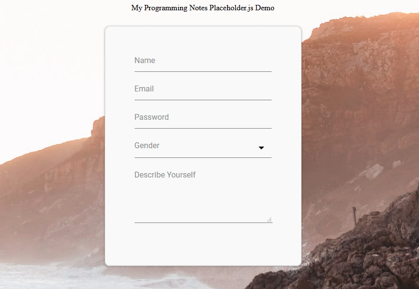
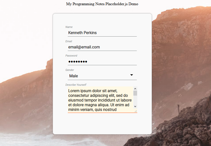
The following is sample HTML used for the floating placeholder label. No special HTML markup is required. Simply supply an element with a ‘placeholder‘ attribute, and you’re all set!
|
1 2 3 4 5 6 7 8 9 10 11 12 |
<!-- // Sample HTML --> <input type="text" placeholder="Name" /> <input type="email" placeholder="Email" /> <input type="password" placeholder="Password" /> <select name="gender" id="gender" placeholder="Gender" > <option value="" selected></option> <option value="male">Male</option> <option value="female">Female</option> <option value="na">Prefer Not To Say</option> </select> <textarea rows="4" cols="50" placeholder="Describe Yourself"></textarea> |
Sample – Blank:
Sample – Filled:
3. Placeholder.js & CSS Source
The following is the Placeholder.js Namespace & CSS Source. Include this in your project to start using!
|
1 2 3 4 5 6 7 8 9 10 11 12 13 14 15 16 17 18 19 20 21 22 23 24 25 26 27 28 29 30 31 32 33 34 35 36 37 38 39 40 41 42 43 44 45 46 47 48 49 50 51 52 53 54 55 56 57 58 59 60 61 62 63 64 65 66 67 68 69 70 71 72 73 74 75 76 77 78 79 80 81 82 83 84 85 86 87 88 89 90 91 92 93 94 95 96 97 98 99 100 101 102 103 104 105 106 107 108 109 110 111 112 113 114 115 116 117 118 119 120 121 122 123 124 125 126 127 128 129 130 131 132 133 134 135 136 137 138 139 140 141 142 143 144 145 146 147 148 149 150 151 152 153 154 155 156 157 158 159 160 161 162 163 164 165 166 167 168 169 170 171 172 173 174 175 176 177 178 179 180 181 182 183 184 185 186 187 188 189 190 191 192 193 194 195 196 197 198 199 200 201 202 203 204 205 206 207 208 209 210 211 212 213 214 215 216 217 218 219 220 221 222 223 224 225 226 227 228 229 230 231 232 233 234 235 236 237 238 239 240 241 242 243 244 245 246 247 248 249 250 251 252 253 254 255 256 257 258 259 260 261 262 263 264 265 266 267 268 269 270 271 272 273 274 275 276 277 278 279 280 281 282 283 284 285 286 287 288 289 290 291 292 293 294 295 296 297 298 299 300 301 302 303 304 305 306 307 308 309 310 311 312 313 314 315 316 317 318 319 320 321 322 323 324 325 326 327 328 329 330 331 332 333 334 335 336 337 338 339 340 341 342 343 344 345 346 347 348 349 350 351 352 353 354 355 356 357 358 359 360 361 362 363 364 365 366 367 368 369 370 371 372 373 374 |
// ============================================================================ // Author: Kenneth Perkins // Date: Sept 9, 2020 // Taken From: http://programmingnotes.org/ // File: Placeholder.js // Description: Module that adds a floating placeholder label to an element // Example: // // Add Placeholder // Placeholder.float('selector') // // // Remove Placeholder // Placeholder.remove('selector') // ============================================================================ /** * NAMESPACE: Placeholder * USE: Handles Placeholder related functions */ var Placeholder = Placeholder || {}; (function(namespace) { 'use strict'; // -- Public data -- // Property to hold public variables and functions let exposed = namespace; // Set class names and other shared data const settings = { attributePlaceholder: 'placeholder', // Element class names classNameFloatingItem: '.floating-placeholder', classNameContainer: '.floating-placeholder-container', classNamePlaceholder: '.floating-placeholder-label', classNameActive: '.active', // Element data names dataNamePlaceholderCache: 'data-placeholder-cache', cleanClassName: (str) => { return str ? str.trim().replace('.', '') : ''; }, }; exposed.settings = settings; /** * FUNCTION: float * USE: Adds a floating placeholder to the selected elements. * @param element: One or more JavaScript element to add floating placeholder to. * @return: N/A. */ exposed.float = (element) => { let items = verifyElements(element); for (const item of items) { addPlaceholder(item); } } /** * FUNCTION: remove * USE: Removes a floating placeholder from the selected elements. * @param element: One or more JavaScript element to remove floating placeholder from. * @return: N/A. */ exposed.remove = (element) => { let items = verifyElements(element); for (const item of items) { removePlaceholder(item); } } // -- Private data -- let removePlaceholder = (element) => { let container = getContainer(element); let parentNode = container.parentNode; removeClass(element, settings.classNameFloatingItem); let placeholderText = getPlaceholderTextCache(element); setPlaceholderText(element, placeholderText); setPlaceholderTextCache(element, null); getEvents().forEach(eventInfo => { eventInfo.names.forEach(eventName => { element.removeEventListener(eventName, eventInfo.callback); }); }); parentNode.insertBefore(element, container); parentNode.removeChild(container); } let addPlaceholder = (element) => { addClass(element, settings.classNameFloatingItem); let placeholderText = verifyPlaceholderText(element); let container = getContainer(element) || createContainer(element); let placeholder = getPlaceholder(element) || createPlaceholder(container); placeholder.innerHTML = placeholderText; placeholder.htmlFor = element.id; getEvents().forEach(eventInfo => { registerEvents(element, eventInfo.names, eventInfo.callback); }); if (!isEmpty(element.value)) { floatPlaceholder(element); } else { resetPlaceholder(element); } setDetectChangeHandler(element); } let setDetectChangeHandler = (element, property = 'value') => { let elementPrototype = Object.getPrototypeOf(element); if (!elementPrototype.hasOwnProperty(property)) { return; } let descriptor = Object.getOwnPropertyDescriptor(elementPrototype, property); let newProps = { get: function () { return descriptor.get.apply(element, arguments); }, set: function (t) { setTimeout( () => { element.dispatchEvent(new Event(property + 'change')); }, 10); return descriptor.set.apply(element, arguments); } }; Object.defineProperty(element, property, newProps); } let floatPlaceholder = (element) => { let placeholder = getPlaceholder(element); if (!isNull(placeholder)) { addClass(placeholder, settings.classNameActive); } } let resetPlaceholder = (element) => { let placeholder = getPlaceholder(element); if (!isNull(placeholder)) { if (isEmpty(element.value)) { removeClass(placeholder, settings.classNameActive); } } } let getContainer = (element) => { return element.closest(settings.classNameContainer); } let getPlaceholder = (element) => { let container = getContainer(element); return !isNull(container) ? container.querySelector(settings.classNamePlaceholder) : null; } let createPlaceholder = (container) => { let placeholder = document.createElement('label'); addClass(placeholder, settings.classNamePlaceholder); container.appendChild(placeholder); return placeholder; } let createContainer = (element) => { let container = document.createElement('div'); let parentNode = element.parentNode; addClass(container, settings.classNameContainer); parentNode.insertBefore(container, element); container.appendChild(element); return container; } let verifyPlaceholderText = (element) => { if (isEmpty(element.id)) { element.id = `floating_placeholder_${randomFromTo(1271991, 7281987)}`; } let placeholderText = getPlaceholderText(element); if (!isEmpty(placeholderText)) { setPlaceholderTextCache(element, placeholderText); } setPlaceholderText(element, null); return getPlaceholderTextCache(element); } let setPlaceholderText = (element, value) => { addData(element, {key: settings.attributePlaceholder, value: value}); } let getPlaceholderText = (element) => { let value = getData(element, settings.attributePlaceholder); return value; } let setPlaceholderTextCache = (element, value) => { addData(element, {key: settings.dataNamePlaceholderCache, value: value}); } let getPlaceholderTextCache = (element) => { let value = getData(element, settings.dataNamePlaceholderCache); return value; } let floatPlaceholderEvent = (event) => { let element = event.currentTarget; let nodeName = element.nodeName.toLowerCase(); switch (event.type) { case 'focus': if (nodeName === 'select') { return; } break; case 'keyup': if (nodeName === 'select') { if (isEmpty(element.value)) { return; } } else { return; } break; } floatPlaceholder(element); } let resetPlaceholderEvent = (event) => { let element = event.currentTarget; let nodeName = element.nodeName.toLowerCase(); switch (event.type) { case 'keyup': if (nodeName === 'select') { if (!isEmpty(element.value)) { return; } } else { return; } break; } resetPlaceholder(element); } let registerEvents = (element, eventNames, func) => { eventNames.forEach((eventName, index) => { element.removeEventListener(eventName, func); element.addEventListener(eventName, func); }); } let addClass = (element, cssClass) => { cssClass = settings.cleanClassName(cssClass); let modified = false; if (cssClass.length > 0 && !hasClass(element, cssClass)) { element.classList.add(cssClass) modified = true; } return modified; } let removeClass = (element, cssClass) => { cssClass = settings.cleanClassName(cssClass); let modified = false; if (cssClass.length > 0 && hasClass(element, cssClass)) { element.classList.remove(cssClass); modified = true; } return modified; } let hasClass = (element, cssClass) => { cssClass = settings.cleanClassName(cssClass); return element.classList.contains(cssClass); } let isNull = (item) => { return undefined === item || null === item; } let isEmpty = (str) => { return isNull(str) || String(str).trim().length < 1; } let randomFromTo = (from, to) => { return Math.floor(Math.random() * (to - from + 1) + from); } let addData = (element, data) => { if (isNull(data)) { return; } else if (!Array.isArray(data)) { data = [data]; } data.forEach(item => { if (!isNull(item.value)) { element.setAttribute(item.key, item.value); } else { removeData(element, item); } }); } let removeData = (element, data) => { if (isNull(data)) { return; } else if (!Array.isArray(data)) { data = [data]; } data.forEach(item => { let key = item.key || item; element.removeAttribute(key); }); } let getData = (element, data) => { if (isNull(data)) { return null; } else if (!Array.isArray(data)) { data = [data]; } let results = []; data.forEach(item => { let key = item.key || item; results.push(element.getAttribute(key)); }); return results.length == 1 ? results[0] : results; } let isString = (item) => { return 'string' === typeof item; } let verifyElements = (items) => { if (isNull(items)) { throw new TypeError('No elements specified'); } else if (isString(items)) { items = document.querySelectorAll(items); } if (!isArrayLike(items)) { items = [items]; } return items; } // see if it looks and smells like an iterable object, and do accept length === 0 let isArrayLike = (item) => { return ( Array.isArray(item) || (!!item && typeof item === "object" && typeof (item.length) === "number" && (item.length === 0 || (item.length > 0 && (item.length - 1) in item) ) ) ); } let getEvents = () => { return [ {names: ['click', 'focus', 'keyup', 'valuechange'], callback: floatPlaceholderEvent}, {names: ['blur', 'focusout', 'keyup', 'valuechange'], callback: resetPlaceholderEvent}, ]; } (function (factory) { if (typeof define === 'function' && define.amd) { define([], factory); } else if (typeof exports === 'object') { module.exports = factory(); } }(function() { return namespace; })); }(Placeholder)); // http://programmingnotes.org/ |
The following is Placeholder.css.
|
1 2 3 4 5 6 7 8 9 10 11 12 13 14 15 16 17 18 19 20 21 22 23 24 25 26 27 28 29 30 31 32 33 34 35 36 37 38 39 40 41 42 43 44 45 46 47 48 49 50 51 52 53 54 55 56 57 58 59 60 61 62 63 64 65 66 67 68 69 70 71 72 73 74 75 76 77 78 |
/* // ============================================================================ // Author: Kenneth Perkins // Date: Sept 9, 2020 // Taken From: http://programmingnotes.org/ // File: Placeholder.css // Description: CSS for the floating placeholder // ============================================================================ */ @import url('https://fonts.googleapis.com/css?family=Roboto:400,400italic,500,500italic,700,700italic,900,900italic,300italic,300,100italic,100'); .floating-placeholder { align-self: flex-end; } .floating-placeholder:focus { border: none; outline:none; background-color: #fff9e5; border-bottom: 1px solid orangered; } .floating-placeholder-label { position: absolute; top: 0; left: 0; font-size: 16px; pointer-events: none; transition: all 150ms ease-in-out; font-family: inherit; } .floating-placeholder-label.active { top: -12.5px; left: -9px; font-size: 11px; font-style: italic; } .floating-placeholder-container { position: relative; margin-bottom: 25px; display: flex; color: #898d8d; font-family: "Roboto",sans-serif, Marmelad,"Lucida Grande",Arial,"Hiragino Sans GB",Georgia,"Helvetica Neue",Helvetica; } .floating-placeholder-container input, .floating-placeholder-container textarea, .floating-placeholder-container select { border: 0; border-bottom: 1px solid #767c7c; background: transparent; width: 100%; padding: 8px 0 5px 0.15em; font-size: 16px; font-family: inherit; color: black; } .floating-placeholder-container select { appearance: none; background-image: url("data:image/svg+xml;utf8,<svg fill='black' height='1' viewBox='0 0 30 30' width='1' xmlns='http://www.w3.org/2000/svg'><path d='M7 10l5 5 5-5z'/><path d='M0 0h24v24H0z' fill='none'/></svg>"); background-size: 35px 35px; background-repeat: no-repeat; background-position-x: 100%; background-position-y: 50%; } .floating-placeholder-container select::-ms-expand { display: none; } .floating-placeholder-container select option { color: black; background-color: white; } /* // http://programmingnotes.org/ */ |
4. More Examples
Below are more examples demonstrating the use of ‘Placeholder.js‘. Don’t forget to include the module when running the examples!
|
1 2 3 4 5 6 7 8 9 10 11 12 13 14 15 16 17 18 19 20 21 22 23 24 25 26 27 28 29 30 31 32 33 34 35 36 37 38 39 40 41 42 43 44 45 46 47 48 49 50 51 52 53 54 55 56 57 58 59 60 61 62 63 64 65 66 67 68 69 70 71 72 73 74 75 76 77 78 79 80 81 82 83 84 85 86 87 |
<!-- // ============================================================================ // Author: Kenneth Perkins // Date: Sept 9, 2020 // Taken From: http://programmingnotes.org/ // File: placeholderDemo.html // Description: Demonstrates the use of Placeholder.js // ============================================================================ --> <!DOCTYPE html> <html> <head> <meta charset="utf-8"/> <title>My Programming Notes Placeholder.js Demo</title> <style> .main { text-align:center; margin-left:auto; margin-right:auto; } .inline { display:inline-block; } .center { display: flex; justify-content: center; align-items: center; } .container { width: 280px; border: 1px solid lightgrey; padding: 60px; border-radius: 10px; margin-top: 30px; background-color: #f9f9f9; box-shadow: 0 0 3px rgba(0,0,0,0.3); } body { background-image: url("https://images.pexels.com/photos/3116416/pexels-photo-3116416.jpeg?auto=compress&cs=tinysrgb&dpr=3&h=750&w=1260"); background-position: center; background-origin: content-box; background-repeat: no-repeat; background-size: cover; min-height:100vh; } </style> <!-- // Include module --> <link type="text/css" rel="stylesheet" href="./Placeholder.css"> <script type="text/javascript" src="./Placeholder.js"></script> </head> <body> <div class="main"> My Programming Notes Placeholder.js Demo <div class="center"> <div class="container"> <input type="text" placeholder="Name" /> <input type="email" placeholder="Email" /> <input type="password" placeholder="Password" /> <select name="gender" id="gender" placeholder="Gender" > <option value="" selected></option> <option value="male">Male</option> <option value="female">Female</option> <option value="na">Prefer Not To Say</option> </select> <textarea rows="4" cols="50" placeholder="Describe Yourself"></textarea> </div> </div> </div> <script> document.addEventListener("DOMContentLoaded", function(eventLoaded) { // Add floating placeholder to the selected elements Placeholder.float('input:not([type="radio"]):not([type="checkbox"]), select, textarea'); // Remove floating placeholder to the selected elements //Placeholder.remove(document.querySelectorAll('input:not([type="radio"]):not([type="checkbox"]), select, textarea')); }); </script> </body> </html><!-- // http://programmingnotes.org/ --> |
QUICK NOTES:
The highlighted lines are sections of interest to look out for.
The code is heavily commented, so no further insight is necessary. If you have any questions, feel free to leave a comment below.
JavaScript/CSS/HTML || Modal.js – Simple Modal Popup Panel Using Vanilla JavaScript
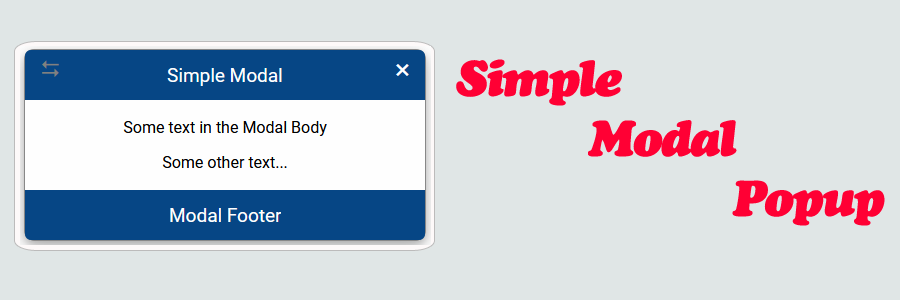
The following is a module which allows for a simple modal popup panel in vanilla JavaScript. Options include allowing the modal to be dragged, resized, and closed on outer area click.
Modal drag and resize supports touch (mobile) input.
Contents
1. Basic Usage

2. Modal HTML

3. Initialize Modal Options

4. Modal Dialog

5. Modal.js & CSS Source

6. More Examples
1. Basic Usage
Syntax is very straightforward. The following demonstrates showing and hiding a modal popup.
|
1 2 3 4 5 6 7 8 9 10 11 12 13 |
// Opening & Closing Modal. <script> (() => { // Shows the modal popup. It accepts either a string selector // or a Javascript element Modal.show('selector'); // Hides the modal popup. It accepts either a string selector // or a Javascript element Modal.hide(document.querySelector('selector')); })(); </script> |
‘Modal.show‘ and ‘Modal.hide‘ accepts either a string selector or a Javascript element.
2. Modal HTML
The following is the HTML used to display the modal. The attributes supplied to the ‘modal’ element specifies whether it is allowed to be dragged, resized, or closed on outer area click.
|
1 2 3 4 5 6 7 8 9 10 11 12 13 14 15 16 17 18 19 20 21 22 23 24 25 26 27 |
<!-- // Available options --> <!-- The Modal Background--> <section id="modalExample" class="modal" data-closeOnOuterClick="true" data-draggable="true" data-resizable="true" > <!-- Modal Panel --> <article class="modal-panel"> <header class="modal-header"> <div class="modal-header-text"> Modal Header </div> <div class="modal-close-button"></div> </header> <div class="modal-body"> <p>Some text in the Modal Body</p> <p>Some other text...</p> </div> <footer class="modal-footer"> <div class="modal-footer-text"> Modal Footer </div> </footer> </article> </section> |
Sample:
3. Initialize Modal Options
In order for the options on the modal to take effect, it needs to be initialized.
The following example demonstrates initializing the modal popup options.
|
1 2 3 4 5 6 7 8 |
// Initialize options. <script> document.addEventListener("DOMContentLoaded", function(eventLoaded) { // Sets up the modal option button clicks Modal.init(); }); </script> |
Note: ‘Modal.init‘ only needs to be called once. It will initialize all modals on the page.
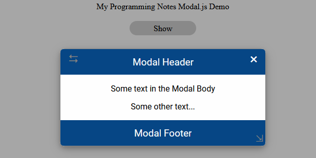
4. Modal Dialog
The following demonstrates adding a simple dialog to the page.
For more options, click here!
|
1 2 3 4 5 6 7 8 9 10 11 |
// Add simple dialog. <script> (() => { // Adds a simple dialog to the page Modal.showDialog({ title: 'Save Content?', body: 'Content will be saved. Continue?', }); })(); </script> |
Sample:
5. Modal.js & CSS Source
The following is the Modal.js Namespace & CSS Source. Include this in your project to start using!
|
1 2 3 4 5 6 7 8 9 10 11 12 13 14 15 16 17 18 19 20 21 22 23 24 25 26 27 28 29 30 31 32 33 34 35 36 37 38 39 40 41 42 43 44 45 46 47 48 49 50 51 52 53 54 55 56 57 58 59 60 61 62 63 64 65 66 67 68 69 70 71 72 73 74 75 76 77 78 79 80 81 82 83 84 85 86 87 88 89 90 91 92 93 94 95 96 97 98 99 100 101 102 103 104 105 106 107 108 109 110 111 112 113 114 115 116 117 118 119 120 121 122 123 124 125 126 127 128 129 130 131 132 133 134 135 136 137 138 139 140 141 142 143 144 145 146 147 148 149 150 151 152 153 154 155 156 157 158 159 160 161 162 163 164 165 166 167 168 169 170 171 172 173 174 175 176 177 178 179 180 181 182 183 184 185 186 187 188 189 190 191 192 193 194 195 196 197 198 199 200 201 202 203 204 205 206 207 208 209 210 211 212 213 214 215 216 217 218 219 220 221 222 223 224 225 226 227 228 229 230 231 232 233 234 235 236 237 238 239 240 241 242 243 244 245 246 247 248 249 250 251 252 253 254 255 256 257 258 259 260 261 262 263 264 265 266 267 268 269 270 271 272 273 274 275 276 277 278 279 280 281 282 283 284 285 286 287 288 289 290 291 292 293 294 295 296 297 298 299 300 301 302 303 304 305 306 307 308 309 310 311 312 313 314 315 316 317 318 319 320 321 322 323 324 325 326 327 328 329 330 331 332 333 334 335 336 337 338 339 340 341 342 343 344 345 346 347 348 349 350 351 352 353 354 355 356 357 358 359 360 361 362 363 364 365 366 367 368 369 370 371 372 373 374 375 376 377 378 379 380 381 382 383 384 385 386 387 388 389 390 391 392 393 394 395 396 397 398 399 400 401 402 403 404 405 406 407 408 409 410 411 412 413 414 415 416 417 418 419 420 421 422 423 424 425 426 427 428 429 430 431 432 433 434 435 436 437 438 439 440 441 442 443 444 445 446 447 448 449 450 451 452 453 454 455 456 457 458 459 460 461 462 463 464 465 466 467 468 469 470 471 472 473 474 475 476 477 478 479 480 481 482 483 484 485 486 487 488 489 490 491 492 493 494 495 496 497 498 499 500 501 502 503 504 505 506 507 508 509 510 511 512 513 514 515 516 517 518 519 520 521 522 523 524 525 526 527 528 529 530 531 532 533 534 535 536 537 538 539 540 541 542 543 544 545 546 547 548 549 550 551 552 553 554 555 556 557 558 559 560 561 562 563 564 565 566 567 568 569 570 571 572 573 574 575 576 577 578 579 580 581 582 583 584 585 586 587 588 589 590 591 592 593 594 595 596 597 598 599 600 601 602 603 604 605 606 607 608 609 610 611 612 613 614 615 616 617 618 619 620 621 622 623 624 625 626 627 628 629 630 631 632 633 634 635 636 637 638 639 640 641 642 643 644 645 646 647 648 649 650 651 652 653 654 655 656 657 658 659 660 661 662 663 664 665 666 667 668 669 670 671 672 673 674 675 676 677 678 679 680 681 682 683 684 685 686 687 688 689 690 691 692 693 694 695 696 697 698 699 700 701 702 703 704 705 706 707 708 709 710 711 712 713 714 715 716 717 718 719 720 721 722 723 724 725 726 727 728 729 730 731 732 733 734 735 736 737 738 739 740 741 742 743 744 745 746 747 748 749 750 751 752 753 754 755 756 757 758 759 760 761 762 763 764 765 766 767 768 769 770 771 772 773 774 775 776 777 778 779 780 781 782 783 784 785 786 787 788 789 790 791 792 793 794 795 796 797 798 799 800 801 802 803 804 805 806 807 808 809 810 811 812 813 814 815 816 817 818 819 820 821 822 823 824 825 826 827 828 829 830 831 832 833 834 835 836 837 838 839 840 841 842 843 844 845 846 847 848 849 850 851 852 853 854 855 856 857 858 859 860 861 862 863 864 865 866 867 868 869 870 871 872 873 874 875 876 877 878 879 880 881 882 883 884 |
// ============================================================================ // Author: Kenneth Perkins // Date: Sept 4, 2020 // Taken From: http://programmingnotes.org/ // File: Modal.js // Description: Javascript that handles modal popup related functions // Example: // // Show Modal // Modal.show('selector') // // // Hide Modal // Modal.hide('selector') // ============================================================================ /** * NAMESPACE: Modal * USE: Handles Modal related functions */ var Modal = Modal || {}; (function(namespace) { 'use strict'; // -- Public data -- // Property to hold public variables and functions let exposed = namespace; // Set class names and other shared data const settings = { handleTypeResize: 'resize', handleTypeDrag: 'drag', // Element class names classNameModal: '.modal', classNameModalPanel: '.modal-panel', classNameCloseButton: '.modal-close-button', classNameModalHeader: '.modal-header', classNameModalHeaderText: '.modal-header-text', classNameModalBody: '.modal-body', classNameModalFooter: '.modal-footer', classNameModalFooterText: '.modal-footer-text', classNameDraggable: '.modal-draggable', classNameDraggableIcon: '.icon', classNameShow: '.show', classNameResizable: '.modal-resizable', classNameResizableIcon: '.icon', classNameDialog: '.dialog', classNameButton: '.modal-button', classNameButtonCancel: '.cancel', classNameButtonOK: '.ok', classNameButtonContainer: '.buttonContainer', classNameResizeMargin: '.resizeMargin', // Element data names dataNameCloseOnOuterClick: 'data-closeOnOuterClick', dataNameDraggable: 'data-draggable', dataNameIsDraggable: 'data-isDraggable', dataNameResizable: 'data-resizable', dataNameIsResizable: 'data-isResizable', cleanClassName: (str) => { return str ? str.trim().replace('.', '') : ''; }, }; exposed.settings = settings; /** * FUNCTION: init * USE: Initializes the modal button clicks. * @param element: JavaScript element to search for modals. * @return: N/A. */ exposed.init = (element = document) => { addClickEvents(element); } /** * FUNCTION: show * USE: Shows the modal popup. * @param element: JavaScript element/String selector of the modal to show. * @return: N/A. */ exposed.show = (element) => { element = verifyElement(element); addClass(element, settings.classNameShow); } /** * FUNCTION: hide * USE: Hides the modal popup. * @param element: JavaScript element/String selector of the modal to hide. * @return: N/A. */ exposed.hide = (element) => { element = verifyElement(element); resetPosition(element); removeClass(element, settings.classNameShow); } /** * FUNCTION: getPanel * USE: Returns the modal panel element. * @param element: JavaScript element/String selector of the modal. * @return: The modal panel element. */ exposed.getPanel = (element) => { element = verifyElement(element); return element.querySelector(settings.classNameModalPanel); } /** * FUNCTION: getHeader * USE: Returns the modal header element. * @param element: JavaScript element/String selector of the modal. * @return: The modal header element. */ exposed.getHeader = (element) => { element = verifyElement(element); return element.querySelector(settings.classNameModalHeader); } /** * FUNCTION: getHeaderText * USE: Returns the modal header text element. * @param element: JavaScript element/String selector of the modal. * @return: The modal header text element. */ exposed.getHeaderText = (element) => { element = verifyElement(element); return element.querySelector(settings.classNameModalHeaderText); } /** * FUNCTION: getBody * USE: Returns the modal body element. * @param element: JavaScript element/String selector of the modal. * @return: The modal body element. */ exposed.getBody = (element) => { element = verifyElement(element); return element.querySelector(settings.classNameModalBody); } /** * FUNCTION: getFooter * USE: Returns the modal footer element. * @param element: JavaScript element/String selector of the modal. * @return: The modal footer element. */ exposed.getFooter = (element) => { element = verifyElement(element); return element.querySelector(settings.classNameModalFooter); } /** * FUNCTION: getFooterText * USE: Returns the modal footer text element. * @param element: JavaScript element/String selector of the modal. * @return: The modal footer text element. */ exposed.getFooterText = (element) => { element = verifyElement(element); return element.querySelector(settings.classNameModalFooterText); } /** * FUNCTION: showDialog * USE: Shows a modal dialog box with an OK/Cancel button. * @param options: An object of initialization options. * Its made up of the following properties: * { * title: The title of the dialog * body: The content body of the dialog * onShow(): Optional. Function that allows to do something before show. * Return false to stop showing process * onHide(): Optional. Function that allows to do something before hide. * Return false to stop hidding process * onDestroy(): Optional. Function that allows to do something before * destroy. Return false to stop destroying process * closeOnOuterClick: Optional. Determines if the dialog should close * on outer dialog click. Default is False * draggable: Optional. Determines if the dialog is draggable. * Default is False * resizable: Optional. Determines if the dialog is resizable. * Default is False * autoOpen: Optional. Determines if the dialog should auto open. * Default is True * draggable: Optional. Determines if the dialog is draggable. * Default is False * destroyOnHide: Optional. Determines if the dialog should be removed * from DOM after hiding. Default is True * buttons: Optional. Object allows to add custom buttons to the dialog * } * @return: The modal dialog object. */ exposed.showDialog = (options) => { options = verifyOptions(options); let dialog = createDialog(options); if (toBoolean(options.autoOpen)) { dialog.show(); } return dialog; } // -- Private data -- let verifyOptions = (options) => { if (typeof options !== 'object') { let body = options; options = {}; options.body = body; } return options; } let createDialog = (options) => { let defaultButtons = { cancel: { text: 'Cancel', cssClass: settings.classNameButtonCancel, visible: true, }, ok: { text: 'OK', cssClass: settings.classNameButtonOK, visible: true, }, }; copyDefaults(options, defaultButtons); let modalButtons = options.buttons; let container = document.body; let modal = createElement('section', [settings.classNameModal, settings.classNameDialog]); let modalPanel = createElement('article', [settings.classNameModalPanel, settings.classNameDialog]); let modalHeader = createElement('header', [settings.classNameModalHeader, settings.classNameDialog]); let modalHeaderText = createElement('div', [settings.classNameModalHeaderText, settings.classNameDialog]); let modalBody = createElement('div', [settings.classNameModalBody, settings.classNameDialog]); let modalFooter = createElement('footer', [settings.classNameModalFooter, settings.classNameDialog]); let buttonContainer = createElement('div', [settings.classNameButtonContainer]); modal.appendChild(modalPanel); modalPanel.appendChild(modalHeader); modalHeader.appendChild(modalHeaderText); modalPanel.appendChild(modalBody); modalPanel.appendChild(modalFooter); modalFooter.appendChild(buttonContainer); let showHeaderCloseButton = true; let keys = Object.keys(modalButtons); keys.forEach((prop, index) => { prop = prop.toLowerCase(); let buttonOptions = modalButtons[prop]; if (!isNull(buttonOptions.visible) && !toBoolean(buttonOptions.visible)) { return false; } let text = buttonOptions.text || ''; let cssClass = buttonOptions.cssClass || ''; let button = createElement('button', [settings.classNameButton, settings.classNameDialog, cssClass]); button.innerHTML = !isNull(text) && isEmpty(text) ? ' ' : text; buttonContainer.appendChild(button) registerEvents(button, ['click'], (eventClick) => { if (buttonOptions.onClick) { let value = buttonOptions.onClick.call(button, eventClick); if (!isNull(value) && !value) { return; } } hide(options.destroyOnHide); }); if ((index + 1) === keys.length) { if (toBoolean(options.resizable)) { addClass(button, settings.classNameResizeMargin); } } showHeaderCloseButton = false; }); if (showHeaderCloseButton) { let modalHeaderClose = createElement('div', [settings.classNameCloseButton, settings.classNameDialog]); modalHeader.appendChild(modalHeaderClose); registerEvents(modalHeaderClose, ['click'], (eventClick) => { hide(options.destroyOnHide); }); } modalHeaderText.innerHTML = options.title || ''; modalBody.innerHTML = options.body || ''; modal.id = `modal_${randomFromTo(1271991, 7281987)}`; if (toBoolean(options.closeOnOuterClick)) { modal.setAttribute(settings.dataNameCloseOnOuterClick, options.closeOnOuterClick); } if (toBoolean(options.draggable)) { modal.setAttribute(settings.dataNameDraggable, options.draggable); } if (toBoolean(options.resizable)) { modal.setAttribute(settings.dataNameResizable, options.resizable); } container.appendChild(modal); options.autoOpen = !isNull(options.autoOpen) ? options.autoOpen : true; if (!options.autoOpen) { if (isNull(options.destroyOnHide)) { options.destroyOnHide = false; } } options.destroyOnHide = !isNull(options.destroyOnHide) ? options.destroyOnHide : true; let show = () => { if (options.onShow) { let value = options.onShow.call(this); if (!isNull(value) && !value) { return; } } setTimeout(()=> { exposed.show(modal); }, 10); } let hide = (destroyModal = false) => { if (options.onHide) { let value = options.onHide.call(this); if (!isNull(value) && !value) { return; } } exposed.hide(modal); if (destroyModal) { setTimeout(()=> { destroy(); }, 500); } } let destroy = () => { if (options.onDestroy) { let value = options.onDestroy.call(this); if (!isNull(value) && !value) { return; } } if (!isDestroyed()) { container.removeChild(modal); } } let isDestroyed = () => { return !container.contains(modal); } let isShowing = () => { return hasClass(modal, settings.classNameShow); } addModalClickEvents(modal); if (getCoords(modalFooter).position === 'absolute') { modalFooter.style.position = 'relative'; let coords = getCoords(modalFooter); modalPanel.style['min-width'] = coords.width + 'px'; modalBody.style['padding-bottom'] = coords.height + 'px'; modalFooter.style.position = null; } return { modal: modal, show: () => { show(); }, hide: () => { hide(options.destroyOnHide); }, destroy: () => { hide(true); }, isDestroyed: () => { return isDestroyed(); }, isShowing: () => { return isShowing(); } }; } let copyDefaults = (options, defaultButtons) => { if (isNull(options.buttons)) { options.buttons = defaultButtons return; } for (let prop in options.buttons) { prop = prop.toLowerCase(); if (!defaultButtons.hasOwnProperty(prop)) { continue; } options.buttons[prop] = Object.assign(defaultButtons[prop], options.buttons[prop]) } } let createElement = (type, classes) => { let element = document.createElement(type); if (!isNull(classes)) { classes.forEach(item => { addClass(element, item); }); } return element; } let addClickEvents = (element) => { // Add misc click events for the modals let modals = element.querySelectorAll(settings.classNameModal); modals.forEach((modal, index) => { addModalClickEvents(modal, index); }); } let addModalClickEvents = (modal, index = 0) => { let registerCloseOnOuterClick = false; // Add button clicks for the close button let closeButton = modal.querySelector(settings.classNameCloseButton); if (!isNull(closeButton)) { registerEvents(closeButton, ['click'], closeButtonEvent); } // Add functionalty to make the modal draggable if (shouldDrag(modal) && !isDraggable(modal)) { // Get elements and make sure they exist let panel = exposed.getPanel(modal); if (isNull(panel)) { throw new TypeError(`Unable to make Modal #${index + 1} draggable. Reason: Modal has no 'Modal Panel' associated with it.`); } // If a header exists, attach a drag handle to it let handle = getHandle(modal, settings.handleTypeDrag); if (isNull(handle)) { let header = exposed.getHeader(modal); if (!isNull(header)) { handle = createHandle(header, settings.handleTypeDrag); } else { addClass(panel, settings.classNameDraggable); } } makeDraggable({ element: panel, handle: handle, keepInViewPort: true, }); // Mark that this modal is draggable setIsDraggable(modal, true) } // Add functionalty to make the modal resizable if (shouldResize(modal) && !isResizable(modal)) { // Get elements and make sure they exist let panel = exposed.getPanel(modal); if (isNull(panel)) { throw new TypeError(`Unable to make Modal #${index + 1} resizable. Reason: Modal has no 'Modal Panel' associated with it.`); } // If a footer exists, attach a resize handle to it let handle = getHandle(modal, settings.handleTypeResize); if (isNull(handle)) { let footer = exposed.getFooter(modal); if (!isNull(footer)) { handle = createHandle(footer, settings.handleTypeResize); } else { addClass(panel, settings.classNameResizable); } } makeResizable({ element: panel, handle: handle, keepInViewPort: true, }); // Mark that this modal is resizable setIsResizable(modal, true); } // Check to see if we need to register the close on click event if (!registerCloseOnOuterClick) { registerCloseOnOuterClick = shouldCloseOnOuterClick(modal); } // Determine if the modal should close if the outer area is clicked if (registerCloseOnOuterClick) { registerEvents(document, ['click'], backgroundHideEvent); } } let registerEvents = (element, eventNames, func) => { eventNames.forEach((eventName, index) => { element.removeEventListener(eventName, func); element.addEventListener(eventName, func); }); } let closeButtonEvent = (event) => { let closeButton = event.target || event.currentTarget; if (isNull(closeButton)) { return; } let modal = closeButton.closest(settings.classNameModal); exposed.hide(modal); } let backgroundHideEvent = (event) => { let target = event.target; if (isNull(target) || !isElement(target) || !hasClass(target, settings.classNameModal) || !hasClass(target, settings.classNameShow) || !shouldCloseOnOuterClick(target)) { return; } exposed.hide(target); } let createHandle = (container, type) => { let handle = document.createElement('div'); switch (type) { case settings.handleTypeResize: addClass(handle, settings.classNameResizable); addClass(handle, settings.classNameResizableIcon); break; case settings.handleTypeDrag: addClass(handle, settings.classNameDraggable); addClass(handle, settings.classNameDraggableIcon); break; default: throw new TypeError(`Unknown handle type: ${type}`); break; } handle.setAttribute('tabindex', 0); container.appendChild(handle); return handle; } let getHandle = (element, type) => { let selector = null; switch (type) { case settings.handleTypeResize: selector = `${settings.classNameResizable}${settings.classNameResizableIcon}`; break; case settings.handleTypeDrag: selector = `${settings.classNameDraggable}${settings.classNameDraggableIcon}`; break; default: throw new TypeError(`Unknown handle type: ${type}`); break; } return element.querySelector(selector); } let makeResizable = (options) => { let resizable = options.element || options; let handle = options.handle || resizable; let keepInViewPort = !isNull(options.keepInViewPort) ? options.keepInViewPort : false; let coords = getCoords(resizable); let initialWidth = coords.width; let initialHeight = coords.height; let mouseDown = (event) => { event.stopPropagation(); // Get the mouse down position of the element let coords = getCoords(resizable); let offsetX = event.clientX - coords.width; let offsetY = event.clientY - coords.height; let moveElement = (event) => { // Get the new position let newWidth = (event.clientX - offsetX); let newHeight = (event.clientY - offsetY); // Make sure the width/height is never less than the initial values newWidth = Math.max(newWidth, initialWidth); newHeight = Math.max(newHeight, initialHeight); setPosition(resizable, {width: newWidth, height: newHeight}); if (keepInViewPort && !isInViewport(resizable)) { let bounding = resizable.getBoundingClientRect(); let viewInfo = getViewportInfo(); let viewportHeight = viewInfo.height; let viewportWidth = viewInfo.width; if (bounding.bottom > viewportHeight) { newHeight -= Math.abs(bounding.bottom - viewportHeight); } if (bounding.right > viewportWidth) { newWidth -= Math.abs(bounding.right - viewportWidth); } setPosition(resizable, {width: newWidth, height: newHeight}); } } let reset = (event) => { document.removeEventListener('mousemove', moveElement); document.removeEventListener('mouseup', reset); } document.addEventListener('mouseup', reset); document.addEventListener('mousemove', moveElement); } addTouchSupport(handle); handle.addEventListener('mousedown', mouseDown); } let makeDraggable = (options) => { let draggable = options.element || options; let handle = options.handle || draggable; let keepInViewPort = !isNull(options.keepInViewPort) ? options.keepInViewPort : false; let mouseDown = (event) => { // Get the mouse down position of the element let coords = getCoords(draggable); let offsetX = event.clientX - coords.left; let offsetY = event.clientY - coords.top; let moveElement = (event) => { // Get the new position let newLeft = event.clientX - offsetX; let newTop = event.clientY - offsetY; setPosition(draggable, {left: newLeft, top: newTop}); if (keepInViewPort && !isInViewport(draggable)) { let bounding = draggable.getBoundingClientRect(); let viewInfo = getViewportInfo(); let viewportHeight = viewInfo.height; let viewportWidth = viewInfo.width; if (bounding.left < 0) { newLeft += Math.abs(bounding.left); } if (bounding.top < 0) { newTop += Math.abs(bounding.top); } if (bounding.bottom > viewportHeight) { newTop -= Math.abs(bounding.bottom - viewportHeight); } if (bounding.right > viewportWidth) { newLeft -= Math.abs(bounding.right - viewportWidth); } setPosition(draggable, {left: newLeft, top: newTop}); } } let reset = (event) => { document.removeEventListener('mousemove', moveElement); document.removeEventListener('mouseup', reset); } document.addEventListener('mouseup', reset); document.addEventListener('mousemove', moveElement); } addTouchSupport(handle); handle.addEventListener('mousedown', mouseDown); } // Check to make sure the element will be within our viewport boundary let isInViewport = (element) => { let bounding = element.getBoundingClientRect(); let viewInfo = getViewportInfo(); return ( bounding.top >= 0 && bounding.left >= 0 && bounding.bottom <= viewInfo.height && bounding.right <= viewInfo.width ); } let getViewportInfo = () => { return { height: Math.max(window.innerHeight || 0, document.documentElement.clientHeight || 0), width: Math.max(window.innerWidth || 0, document.documentElement.clientWidth || 0), }; } let getCoords = (element) => { let computedStyle = window.getComputedStyle(element); let intProps = ['left', 'top', 'width', 'height']; let result = {}; for (const prop of intProps) { result[prop] = parseInt(computedStyle[prop], 10) || parseInt(element.style[prop], 10) || 0; } let stringProps = ['position']; for (const prop of stringProps) { result[prop] = (computedStyle[prop] || element.style[prop]).toLowerCase(); } if (result.position !== 'relative') { if (!result.left) { result.left = element.offsetLeft || 0; } if (!result.top) { result.top = element.offsetTop || 0; } if (!result.width) { result.width = element.offsetWidth || 0; } if (!result.height) { result.height = element.offsetHeight || 0; } } return result; } let addTouchSupport = (element) => { let events = ['touchstart', 'touchmove', 'touchend', 'touchcancel']; registerEvents(element, events, touchConverter); } let touchConverter = (event) => { // stop touch event event.stopPropagation(); event.preventDefault(); let touches = event.changedTouches; if (!touches || touches.length < 1) { return; } let first = touches[0]; let target = first.target; let type = ''; switch (event.type) { case 'touchstart': type = 'mousedown'; break; case 'touchmove': type = 'mousemove'; break; case 'touchend': case 'touchcancel': type = 'mouseup'; break; default: return; } let simulatedEvent = null; try { simulatedEvent = new MouseEvent(type, { bubbles: true, cancelable: true, view: window, screenX: first.screenX, screenY: first.screenY, clientX: first.clientX, clientY: first.clientY, }); } catch (e) { simulatedEvent = document.createEvent('MouseEvent'); simulatedEvent.initMouseEvent(type, true, true, window, 1, first.screenX, first.screenY, first.clientX, first.clientY, false, false, false, false, 0 /*left*/, null); } target.dispatchEvent(simulatedEvent); } let resetPosition = (element) => { let panel = exposed.getPanel(element); if (isNull(panel)) { return; } setPosition(panel, {left: null, top: null, width: null, height: null}); } let setPosition = (element, options) => { for (const prop in options) { if (prop in element.style) { let value = options[prop]; element.style[prop] = !isNull(value) ? parseInt(value, 10) + 'px' : value; } } } let shouldCloseOnOuterClick = (element) => { let value = element.getAttribute(settings.dataNameCloseOnOuterClick); return toBoolean(value); } let shouldDrag = (element) => { let value = element.getAttribute(settings.dataNameDraggable); return toBoolean(value); } let setIsDraggable = (element, value) => { element.setAttribute(settings.dataNameIsDraggable, value); } let isDraggable = (element) => { let value = element.getAttribute(settings.dataNameIsDraggable); return toBoolean(value); } let shouldResize = (element) => { let value = element.getAttribute(settings.dataNameResizable); return toBoolean(value); } let setIsResizable = (element, value) => { element.setAttribute(settings.dataNameIsResizable, value); } let isResizable = (element) => { let value = element.getAttribute(settings.dataNameIsResizable); return toBoolean(value); } let verifyElement = (element) => { if (isString(element)) { element = document.querySelector(element); } if (isNull(element)) { throw new TypeError(`Unable to process. Element provided is null`); } else if (!isElement(element)) { throw new TypeError(`Unable to process element of type: ${typeof element}. Reason: '${element}' is not an HTMLElement.`); } return element; } let addClass = (element, cssClass) => { cssClass = settings.cleanClassName(cssClass); let modified = false; if (cssClass.length > 0 && !hasClass(element, cssClass)) { element.classList.add(cssClass) modified = true; } return modified; } let removeClass = (element, cssClass) => { cssClass = settings.cleanClassName(cssClass); let modified = false; if (cssClass.length > 0 && hasClass(element, cssClass)) { element.classList.remove(cssClass); modified = true; } return modified; } let hasClass = (element, cssClass) => { cssClass = settings.cleanClassName(cssClass); return element.classList.contains(cssClass); } let isString = (item) => { return 'string' === typeof item; } let isNull = (item) => { return undefined === item || null === item; } let isElement = (item) => { let value = false; try { value = item instanceof HTMLElement || item instanceof HTMLDocument; } catch (e) { value = (typeof item==="object") && (item.nodeType===1) && (typeof item.style === "object") && (typeof item.ownerDocument ==="object"); } return value; } let toBoolean = (value) => { value = String(value).trim().toLowerCase(); let ret = false; switch (value) { case 'true': case 'yes': case '1': ret = true; break; } return ret; } let isEmpty = (str) => { return isNull(str) || String(str).trim().length < 1; } let randomFromTo = (from, to) => { return Math.floor(Math.random() * (to - from + 1) + from); } (function (factory) { if (typeof define === 'function' && define.amd) { define([], factory); } else if (typeof exports === 'object') { module.exports = factory(); } }(function() { return namespace; })); }(Modal)); // http://programmingnotes.org/ |
The following is Modal.css.
|
1 2 3 4 5 6 7 8 9 10 11 12 13 14 15 16 17 18 19 20 21 22 23 24 25 26 27 28 29 30 31 32 33 34 35 36 37 38 39 40 41 42 43 44 45 46 47 48 49 50 51 52 53 54 55 56 57 58 59 60 61 62 63 64 65 66 67 68 69 70 71 72 73 74 75 76 77 78 79 80 81 82 83 84 85 86 87 88 89 90 91 92 93 94 95 96 97 98 99 100 101 102 103 104 105 106 107 108 109 110 111 112 113 114 115 116 117 118 119 120 121 122 123 124 125 126 127 128 129 130 131 132 133 134 135 136 137 138 139 140 141 142 143 144 145 146 147 148 149 150 151 152 153 154 155 156 157 158 159 160 161 162 163 164 165 166 167 168 169 170 171 172 173 174 175 176 177 178 179 180 181 182 183 184 185 186 187 188 189 190 191 192 193 194 195 196 197 198 199 200 201 202 203 204 205 206 207 208 209 210 211 212 213 214 215 216 217 218 219 220 221 222 223 224 225 226 227 228 229 230 231 232 233 234 235 236 237 238 239 240 241 242 |
/* // ============================================================================ // Author: Kenneth Perkins // Date: Sept 4, 2020 // Taken From: http://programmingnotes.org/ // File: Modal.css // Description: CSS for the modal popup // ============================================================================ */ @import url('https://fonts.googleapis.com/css?family=Roboto:400,400italic,500,500italic,700,700italic,900,900italic,300italic,300,100italic,100'); /* The Modal (background) */ .modal { position: fixed; z-index: 1; padding-top: 60px; left: 0; top: 0; width: 100%; height: 100%; overflow: auto; background-color: rgba(0,0,0,0.35); opacity: 0; visibility: hidden; transform: scale(1.1); transition: visibility 0s linear 0.25s, opacity 0.25s 0s, transform 0.25s; display: flex; justify-content: center; } /* Modal Content */ .modal-panel { position: absolute; background-color: #fefefe; margin: auto; padding: 0; border: 1px solid #888; min-width: 400px; max-width: 80%; box-shadow: 0 4px 8px 0 rgba(0,0,0,0.2),0 6px 20px 0 rgba(0,0,0,0.19); border-radius: 10px; min-height: 135px; display: table; } .modal-close-button { position: absolute; color: white; font-size: 28px; display: inline-block; text-decoration: none; cursor: pointer; right: 0; margin-right: 15px; } .modal-close-button:hover, .modal-close-button:focus { color: black; } .modal-close-button:after { content: '×'; } .modal-body { padding-bottom: 52px; } .modal-header, .modal-footer { padding: 2px; background-color: #064685; color: white; min-height: 50px; box-sizing: border-box; text-align: center; } .modal-header { border-top-left-radius: 6px; border-top-right-radius: 6px; } .modal-footer { border-bottom-left-radius: 6px; border-bottom-right-radius: 6px; bottom: 0; position: absolute; width: 99.8%; transform: translateY(1%); } .modal-header-text, .modal-footer-text { font-size: 19px; display: inline-block; max-width: 80%; overflow: hidden; white-space: nowrap; text-overflow: ellipsis; margin-top: auto; transform: translateY(50%); } .modal-header-text.bold, .modal-footer-text.bold { font-weight: bold; } .modal.show { opacity: 1; visibility: visible; transform: scale(1.0); transition: visibility 0s linear 0s, opacity 0.25s 0s, transform 0.25s; } .modal-draggable { cursor: move; cursor: grab; } .modal-draggable:active { cursor: move; cursor: grabbing; } .modal-draggable.icon { position: absolute; color: grey; font-size: 23px; display: inline-block; text-decoration: none; left: 0; margin-left: 15px; outline: none; } .modal-draggable.icon:hover, .modal-resizable.icon:hover { color: white; background-color: rgba(0,191,165,.04) } .modal-draggable.icon:active, .modal-resizable.icon:active { color: yellow; } .modal-draggable.icon:after { content: '⮀'; } .modal-resizable { cursor: move; cursor: grab; cursor: nwse-resize; } .modal-resizable:active { cursor: move; cursor: grabbing; cursor: nwse-resize; } .modal-resizable.icon { position: absolute; color: grey; font-size: 20px; display: inline-block; text-decoration: none; width: 10px; height: 10px; right: 0; margin-right: 10px; outline: none; transform: translateY(-200%); bottom: 0; } .modal-resizable.icon:after { content: '⇲'; } .modal-header, .modal-footer, .modal-draggable.icon, .modal-close-button, .modal-body, .modal-button { font-family: "Roboto",sans-serif, Marmelad,"Lucida Grande",Arial,"Hiragino Sans GB",Georgia,"Helvetica Neue",Helvetica; } .modal-button { padding: 4px; background-color: #d2d2d2; text-align: center; text-decoration: none; color: black; border-radius: 15px; cursor: pointer; min-width: 100px; border: none; outline: #eee; font-size: 15px; } .modal-button:hover { background-color:#bdbdbd; } .modal-button.cancel { } .modal-button.ok { } .modal.dialog { } .modal-panel.dialog { } .modal-header.dialog { } .modal-header-text.dialog { } .modal-footer.dialog { display: flex; justify-content: center; align-items: center; width: 100%; padding: 10px; } .modal-body.dialog { margin: 20px; text-align: center; } .modal-button.dialog { min-width: 150px; margin-top: 1px; } .modal-button:not(:last-child) { margin-right: 20px; } .modal-button.resizeMargin { margin-right: 16px; } .buttonContainer { max-width: 600px; }/* // http://programmingnotes.org/ */ |
6. More Examples
Below are more examples demonstrating the use of ‘Modal.js‘. Don’t forget to include the module when running the examples!
|
1 2 3 4 5 6 7 8 9 10 11 12 13 14 15 16 17 18 19 20 21 22 23 24 25 26 27 28 29 30 31 32 33 34 35 36 37 38 39 40 41 42 43 44 45 46 47 48 49 50 51 52 53 54 55 56 57 58 59 60 61 62 63 64 65 66 67 68 69 70 71 72 73 74 75 76 77 78 79 80 81 82 83 84 85 86 87 88 89 90 91 92 93 94 95 96 97 98 99 100 101 102 103 104 105 106 107 108 109 110 111 112 113 114 115 116 117 118 119 120 121 122 123 124 125 |
<!-- // ============================================================================ // Author: Kenneth Perkins // Date: Sept 4, 2020 // Taken From: http://programmingnotes.org/ // File: modalDemo.html // Description: Demonstrates the use of Modal.js // ============================================================================ --> <!DOCTYPE html> <html> <head> <meta charset="utf-8"/> <title>My Programming Notes Modal.js Demo</title> <style> .main { text-align:center; margin-left:auto; margin-right:auto; } .button { padding: 5px; background-color: #d2d2d2; height:100%; text-align:center; text-decoration:none; color:black; display: flex; justify-content: center; align-items: center; flex-direction: column; border-radius: 15px; cursor: pointer; width: 120px; } .button:hover { background-color:#bdbdbd; } .inline { display:inline-block; } .center { display: flex; justify-content: center; align-items: center; } .modal-body { padding: 2px 16px; } </style> <!-- // Include module --> <link type="text/css" rel="stylesheet" href="./Modal.css"> <script type="text/javascript" src="./Modal.js"></script> </head> <body> <div class="main"> My Programming Notes Modal.js Demo <div style="margin-top: 20px;"> <div id="btnShow" class="inline button"> Show </div> </div> <!-- The Modal Background--> <section id="modalExample" class="modal" data-closeOnOuterClick="true" data-draggable="true" data-resizable="true" > <!-- Modal Panel --> <article class="modal-panel"> <header class="modal-header"> <div class="modal-header-text"> Modal Header </div> <div class="modal-close-button"></div> </header> <div class="modal-body"> <p>Some text in the Modal Body</p> <p>Some other text...</p> </div> <footer class="modal-footer"> <div class="modal-footer-text"> Modal Footer </div> </footer> </article> </section> </div> <script> document.addEventListener("DOMContentLoaded", function(eventLoaded) { // Optional: Sets up the initial default button clicks Modal.init(); // Show the modal document.querySelector('#btnShow').addEventListener('click', (event) => { Modal.show('#modalExample'); }); // Get the modal element let modalElement = document.querySelector('#modalExample'); setTimeout(() => { Modal.show(modalElement); setTimeout(() => { Modal.hide(modalElement); }, 2000); }, 200); }); </script> </body> </html><!-- // http://programmingnotes.org/ --> |
QUICK NOTES:
The highlighted lines are sections of interest to look out for.
The code is heavily commented, so no further insight is necessary. If you have any questions, feel free to leave a comment below.
JavaScript || Movement.js – Move, Resize, Drag & Drop Elements With The Mouse, Mobile Touch & Keyboard Using Vanilla JavaScript
The following is a module that handles dragging and resizing elements with a mouse/touch, moving elements with the keyboard via the arrow keys, and drag and dropping elements onto a drop zone.
Contents
1. Basic Usage

2. Draggable - Available Options

3. Resizable - Available Options

4. Movable - Available Options

5. Droppable - Available Options

6. Movement.js Namespace

7. More Examples
1. Basic Usage
Syntax is very straightforward. The following demonstrates basic usage to enable element movement.
|
1 2 3 4 5 6 7 8 9 10 11 12 13 14 15 16 17 18 19 20 |
// Basic Usage. <script> (() => { // Makes elements movable with the mouse / touch Movement.draggable(document.querySelectorAll('Selector')); // Makes elements resizable with the mouse / touch Movement.resizable(document.querySelectorAll('Selector')); // Makes elements movable with the keyboard arrow keys Movement.movable(document.querySelectorAll('Selector')); // Makes elements drag and droppable with the mouse Movement.droppable({ element: document.querySelectorAll('Selector'), dropZone: document.querySelectorAll('Selector') }); })(); </script> |
‘Movement.draggable‘ makes an element draggable via the mouse/touch input. ‘Movement.resizable‘ makes an element resizable via the mouse/touch input. ‘Movement.movable‘ makes an element movable via the keyboard arrow keys. ‘Movement.droppable‘ makes an element droppable via a dropzone/allows files to be dropped to dropzone.
2. Draggable – Available Options
‘Movement.draggable‘ makes an element draggable via the mouse/touch input.
The options supplied to the ‘Movement.draggable‘ function is an object that is made up of the following properties.
|
1 2 3 4 5 6 7 8 9 10 11 12 13 14 15 16 17 18 19 20 21 22 23 24 25 |
// Movement.draggable - Available Options. <script> (() => { // Makes an element draggable via the mouse/touch input Movement.draggable({ element: document.querySelectorAll('Selector'), // One or more Javascript elements of the elements to make draggable with the Mouse/Touch handle: document.querySelectorAll('Selector'), // Optional. One or more Javascript elements that restricts dragging from starting unless mousedown occurs on the specified element container: document.querySelector('Selector'), // Optional. A Javascript element of the container to only restrict the draggable element to onMoveStart: (position, event) => { // Optional. Function that allows to do something on move start console.log(`Draggable Start: Left: ${position.left}, Top: ${position.top}`); }, onMove: (position, event) => { // Optional. Function that allows to do something on move. The position.left and position.top can be modified console.log(`Draggable Move: Left: ${position.left}, Top: ${position.top}`); // Example modifying the element position //position.top = position.previous.top; }, onMoveEnd: (position, event) => { // Optional. Function that allows to do something on move end console.log(`Draggable End: Left: ${position.left}, Top: ${position.top}`); }, keepInViewPort: false, // Optional. Restricts the draggable element only to the visible viewport area. Default is False }); })(); </script> |
3. Resizable – Available Options
‘Movement.resizable‘ makes an element resizable via the mouse/touch input.
The options supplied to the ‘Movement.resizable‘ function is an object that is made up of the following properties.
|
1 2 3 4 5 6 7 8 9 10 11 12 13 14 15 16 17 18 19 20 21 22 23 24 25 |
// Movement.resizable - Available Options. <script> (() => { // Makes an element resizable via the mouse/touch input Movement.resizable({ element: document.querySelectorAll('Selector'), // One or more Javascript elements of the elements to make resizable with the Mouse/Touch handle: document.querySelectorAll('Selector'), // Optional. One or more Javascript elements that restricts resizing from starting unless mousedown occurs on the specified element container: document.querySelector('Selector'), // Optional. A Javascript element of the container to only restrict the resizable element to onMoveStart: (position, event) => { // Optional. Function that allows to do something on move start console.log(`Resizable Start: Width: ${position.width}, Height: ${position.height}`); }, onMove: (position, event) => { // Optional. Function that allows to do something on move. The position.width, position.height can be modified console.log(`Resizable Move: Width: ${position.width}, Height: ${position.height}`); // Example modifying the element position //position.height = position.previous.height; }, onMoveEnd: (position, event) => { // Optional. Function that allows to do something on move end console.log(`Resizable End: Width: ${position.width}, Height: ${position.height}`); }, keepInViewPort: true, // Optional. Restricts the resizable element only to the visible viewport area. Default is False maintainInitialSize: true, // Optional. Ensures the element doesnt resize smaller than its initial size. Default is False }); })(); </script> |
4. Movable – Available Options
‘Movement.movable‘ makes an element movable via the keyboard arrow keys.
The options supplied to the ‘Movement.movable‘ function is an object that is made up of the following properties.
|
1 2 3 4 5 6 7 8 9 10 11 12 13 14 15 16 17 18 19 20 21 22 23 24 25 |
// Movement.movable - Available Options. <script> (() => { // Makes an element movable via the keyboard arrow keys Movement.movable({ element: document.querySelectorAll('Selector'), // One or more Javascript elements of the elements to make movable with the Keyboard container: document.querySelector('Selector'), // Optional. A Javascript element of the container to only restrict the movable element to onMoveStart: (position, event) => { // Optional. Function that allows to do something on move start console.log(`Movable Start: Left: ${position.left}, Top: ${position.top}`); }, onMove: (position, event) => { // Optional. Function that allows to do something on move. The position.left, position.top and distance can be modified console.log(`Movable Move: Left: ${position.left}, Top: ${position.top}`); // Example modifying the element position //position.top = position.previous.top; }, onMoveEnd: (position, event) => { // Optional. Function that allows to do something on move end console.log(`Movable End: Left: ${position.left}, Top: ${position.top}`); }, distance: null, // Optional. The distance to move the element (in pixels) on keydown. Default is 5 keepInViewPort: false, // Optional. Restricts the movable element only to the visible viewport area. Default is False attachEventToWindow: true, // Optional. Determine if key down/up events should attach to the window or the element. If false, event is attached to the element. Default is True }); })(); </script> |
5. Droppable – Available Options
‘Movement.droppable‘ makes an element droppable via a dropzone/allows files to be dropped to dropzone.
The options supplied to the ‘Movement.droppable‘ function is an object that is made up of the following properties.
|
1 2 3 4 5 6 7 8 9 10 11 12 13 14 15 16 17 18 19 20 21 22 23 24 25 26 27 28 29 30 31 32 33 34 35 36 37 |
// Movement.droppable - Available Options. <script> (() => { // Makes an element droppable via a dropzone/allows files to be dropped to dropzone Movement.droppable({ element: document.querySelectorAll('Selector'), // Optional. One or more Javascript elements of the elements drag and droppable elements dropZone: document.querySelectorAll('Selector'), // Optional. One or more Javascript elements of the dropzone elements onMoveStart: (position, event) => { // Optional. Function that allows to do something on move start console.log(`Droppable Start: Left: ${position.left}, Top: ${position.top}. Type: ${event.type}`); }, onMove: (position, event) => { // Optional. Function that allows to do something on move. console.log(`Droppable Move: Left: ${position.left}, Top: ${position.top}. Type: ${event.type}`); switch (event.type) { case 'dragleave': break; case 'dragover': break; case 'drag': break; } }, onMoveEnd: (position, event) => { // Optional. Function that allows to do something on move end switch (event.type) { case 'dragend': console.log(`Droppable End: Left: ${position.left}, Top: ${position.top}. Type: ${event.type}`); break; case 'drop': break; } }, dragImageUrl: 'https://site.com/image.jpg', // Optional. The image url to display on element drag dropZoneAllowMultiple: false, // Optional. Determines if more than one droppable is allowed on a dropzone. Default is true dropEffect: 'link', // Optional. The feedback (typically visual) the user is given during a drag and drop operation. Default is 'move' }); })(); </script> |
‘Movement.droppable‘ utilizes the HTML Drag and Drop API to facilitate movement. Currently, the API only allows Mouse support.
To allow for touch support, the polyfill DragDropTouch.js is recommended to be used, which simulates the Drag and Drop API. This allows ‘Movement.droppable‘ to be supported with touch input.
6. Movement.js Namespace
The following is the Movement.js Namespace. Include this in your project to start using!
|
1 2 3 4 5 6 7 8 9 10 11 12 13 14 15 16 17 18 19 20 21 22 23 24 25 26 27 28 29 30 31 32 33 34 35 36 37 38 39 40 41 42 43 44 45 46 47 48 49 50 51 52 53 54 55 56 57 58 59 60 61 62 63 64 65 66 67 68 69 70 71 72 73 74 75 76 77 78 79 80 81 82 83 84 85 86 87 88 89 90 91 92 93 94 95 96 97 98 99 100 101 102 103 104 105 106 107 108 109 110 111 112 113 114 115 116 117 118 119 120 121 122 123 124 125 126 127 128 129 130 131 132 133 134 135 136 137 138 139 140 141 142 143 144 145 146 147 148 149 150 151 152 153 154 155 156 157 158 159 160 161 162 163 164 165 166 167 168 169 170 171 172 173 174 175 176 177 178 179 180 181 182 183 184 185 186 187 188 189 190 191 192 193 194 195 196 197 198 199 200 201 202 203 204 205 206 207 208 209 210 211 212 213 214 215 216 217 218 219 220 221 222 223 224 225 226 227 228 229 230 231 232 233 234 235 236 237 238 239 240 241 242 243 244 245 246 247 248 249 250 251 252 253 254 255 256 257 258 259 260 261 262 263 264 265 266 267 268 269 270 271 272 273 274 275 276 277 278 279 280 281 282 283 284 285 286 287 288 289 290 291 292 293 294 295 296 297 298 299 300 301 302 303 304 305 306 307 308 309 310 311 312 313 314 315 316 317 318 319 320 321 322 323 324 325 326 327 328 329 330 331 332 333 334 335 336 337 338 339 340 341 342 343 344 345 346 347 348 349 350 351 352 353 354 355 356 357 358 359 360 361 362 363 364 365 366 367 368 369 370 371 372 373 374 375 376 377 378 379 380 381 382 383 384 385 386 387 388 389 390 391 392 393 394 395 396 397 398 399 400 401 402 403 404 405 406 407 408 409 410 411 412 413 414 415 416 417 418 419 420 421 422 423 424 425 426 427 428 429 430 431 432 433 434 435 436 437 438 439 440 441 442 443 444 445 446 447 448 449 450 451 452 453 454 455 456 457 458 459 460 461 462 463 464 465 466 467 468 469 470 471 472 473 474 475 476 477 478 479 480 481 482 483 484 485 486 487 488 489 490 491 492 493 494 495 496 497 498 499 500 501 502 503 504 505 506 507 508 509 510 511 512 513 514 515 516 517 518 519 520 521 522 523 524 525 526 527 528 529 530 531 532 533 534 535 536 537 538 539 540 541 542 543 544 545 546 547 548 549 550 551 552 553 554 555 556 557 558 559 560 561 562 563 564 565 566 567 568 569 570 571 572 573 574 575 576 577 578 579 580 581 582 583 584 585 586 587 588 589 590 591 592 593 594 595 596 597 598 599 600 601 602 603 604 605 606 607 608 609 610 611 612 613 614 615 616 617 618 619 620 621 622 623 624 625 626 627 628 629 630 631 632 633 634 635 636 637 638 639 640 641 642 643 644 645 646 647 648 649 650 651 652 653 654 655 656 657 658 659 660 661 662 663 664 665 666 667 668 669 670 671 672 673 674 675 676 677 678 679 680 681 682 683 684 685 686 687 688 689 690 691 692 693 694 695 696 697 698 699 700 701 702 703 704 705 706 707 708 709 710 711 712 713 714 715 716 717 718 719 720 721 722 723 724 725 726 727 728 729 730 731 732 733 734 735 736 737 738 739 740 741 742 743 744 745 746 747 748 749 750 751 752 753 754 755 756 757 758 759 760 761 762 763 764 765 766 767 768 769 770 771 772 773 774 775 776 777 778 779 780 781 782 783 784 785 786 787 788 789 790 791 792 793 794 795 796 797 798 799 800 801 802 803 804 805 806 807 808 809 810 811 812 813 814 815 816 817 818 819 820 821 822 823 824 825 826 827 828 829 830 831 832 833 834 835 836 837 838 839 840 841 842 843 844 845 846 847 848 849 850 851 852 853 854 855 856 857 858 859 860 861 862 863 864 865 866 867 868 869 870 871 872 873 874 875 876 877 878 879 880 881 882 883 884 885 886 887 888 889 890 891 892 893 894 895 896 897 898 899 900 901 902 903 904 905 906 907 908 909 910 911 912 913 914 915 916 917 918 919 920 921 922 923 924 925 926 927 928 929 930 931 932 933 934 935 936 937 938 939 940 941 942 943 944 945 946 947 948 949 950 951 952 953 954 955 956 957 958 959 960 961 962 963 964 965 966 967 968 969 970 971 972 973 974 975 976 977 978 979 980 981 982 983 984 985 986 987 988 989 990 991 992 993 994 995 996 997 998 999 1000 1001 1002 1003 1004 1005 1006 1007 1008 1009 1010 1011 1012 1013 1014 1015 1016 1017 1018 1019 1020 1021 1022 1023 1024 1025 1026 1027 1028 1029 1030 1031 1032 1033 1034 1035 1036 1037 1038 1039 1040 1041 1042 1043 1044 1045 1046 1047 1048 1049 1050 1051 1052 1053 1054 1055 1056 1057 1058 1059 1060 1061 1062 1063 1064 1065 1066 1067 1068 1069 1070 1071 1072 1073 1074 1075 1076 1077 1078 1079 1080 1081 1082 1083 1084 1085 1086 1087 1088 1089 1090 1091 1092 1093 1094 1095 1096 1097 1098 1099 1100 1101 1102 1103 1104 1105 1106 1107 1108 1109 1110 1111 1112 1113 1114 1115 1116 1117 1118 1119 1120 1121 1122 1123 1124 1125 1126 1127 1128 1129 1130 1131 1132 1133 1134 1135 1136 1137 1138 1139 1140 1141 1142 1143 1144 1145 1146 1147 1148 1149 1150 1151 1152 1153 1154 1155 1156 1157 1158 1159 1160 1161 1162 1163 1164 1165 1166 1167 1168 1169 1170 1171 1172 1173 1174 1175 1176 1177 1178 1179 1180 1181 1182 1183 1184 1185 1186 1187 1188 1189 1190 1191 1192 1193 1194 1195 1196 1197 1198 1199 1200 1201 1202 1203 1204 1205 1206 1207 1208 1209 1210 1211 1212 1213 1214 1215 1216 1217 1218 1219 1220 1221 1222 1223 1224 1225 1226 1227 1228 1229 1230 1231 1232 1233 1234 1235 1236 1237 1238 1239 1240 1241 1242 1243 1244 1245 1246 1247 1248 1249 1250 1251 1252 1253 1254 1255 1256 1257 1258 1259 1260 1261 1262 1263 1264 1265 1266 1267 1268 1269 1270 1271 1272 1273 1274 1275 1276 1277 1278 1279 1280 1281 1282 1283 1284 1285 1286 1287 1288 1289 1290 1291 1292 1293 1294 1295 1296 1297 1298 1299 1300 1301 1302 1303 1304 1305 1306 1307 1308 1309 1310 1311 1312 1313 1314 1315 1316 1317 1318 1319 1320 1321 1322 1323 1324 1325 1326 1327 1328 1329 1330 1331 1332 1333 1334 1335 1336 1337 1338 1339 1340 1341 1342 1343 1344 1345 1346 1347 1348 1349 1350 1351 1352 1353 1354 1355 1356 1357 1358 1359 1360 1361 1362 1363 1364 1365 1366 1367 1368 1369 1370 1371 1372 1373 1374 1375 1376 1377 1378 1379 1380 1381 1382 |
// ============================================================================ // Author: Kenneth Perkins // Date: Sept 2, 2020 // Taken From: http://programmingnotes.org/ // File: Movement.js // Description: Javascript that allows for element movement on a page // ============================================================================ /** * NAMESPACE: Movement * USE: Handles element movement */ var Movement = Movement || {}; (function(namespace) { 'use strict'; // -- Public data -- // Property to hold public variables and functions let exposed = namespace; // Set class names and other shared data const settings = { // Misc data visibilityTypeTopLeft: 'top_left', visibilityTypeBottomRight: 'bottom_right', visibilityTypeWidth: 'width', visibilityTypeHeight: 'height', keyDirectionUp: 'up', keyDirectionLeft: 'left', keyDirectionDown: 'down', keyDirectionRight: 'right', attributeDraggable: 'draggable', keepInViewPort: false, dropZoneAllowMultiple: true, attachEventToWindow: true, dropEffect: 'move', movableDistance: 5, maintainInitialSize: false, // Element class names classNameModal: '.modal', classNameModalPanel: '.modal-panel', classNameCloseButton: '.modal-close-button', classNameModalHeader: '.modal-header', classNameModalHeaderText: '.modal-header-text', classNameModalBody: '.modal-body', classNameModalFooter: '.modal-footer', classNameDraggable: '.modal-draggable', classNameDraggableIcon: '.icon', classNameShow: '.show', // Element data names dataNameCloseOnClick: 'data-closeOnClick', dataNameDraggable: 'data-draggable', dataNameIsDraggable: 'data-isDraggable', cleanClassName: (str) => { return str ? str.trim().replace('.', '') : ''; }, }; exposed.settings = settings; /** * FUNCTION: draggable * USE: Makes an element draggable via the mouse/touch input. * @param options: An object of initialization options. * Its made up of the following properties: * { * element: One or more Javascript elements of the elements to make * draggable with the Mouse/Touch * handle: Optional. One or more Javascript elements that restricts * dragging from starting unless mousedown occurs on the specified element * container: Optional. A Javascript element of the container to only * restrict the draggable element to * onMoveStart(position, event): Optional. Function that allows to do * something on move start * onMove(position, event): Optional. Function that allows to do * something on move. The position.left, top can be modified * onMoveEnd(position, event): Optional. Function that allows to do * something on move end * keepInViewPort: Optional. Restricts the draggable element only to the * visible viewport area. Default is False * } * @return: N/A. */ exposed.draggable = (options) => { options = verifyDragResizeOptions(options); let handles = options.handle; let draggables = options.element; deleteKeys(options, ['handle', 'element']); for (let index = 0; index < draggables.length; ++index) { let handle = handles[index]; let draggable = draggables[index]; addTouchSupport(handle); registerEvents(handle, ['mousedown'], draggable_mouseDown(draggable, options)); } } /** * FUNCTION: resizable * USE: Makes an element resizable via the mouse/touch input. * @param options: An object of initialization options. * Its made up of the following properties: * { * element: One or more Javascript elements of the elements to make * resizable with the Mouse/Touch * handle: Optional. One or more Javascript elements that restricts * dragging from starting unless mousedown occurs on the specified element * container: Optional. A Javascript element of the container to only * restrict the resizable element to * onMoveStart(position, event): Optional. Function that allows to do * something on move start * onMove(position, event): Optional. Function that allows to do * something on move. The position.width, height can be modified * onMoveEnd(position, event): Optional. Function that allows to do * something on move end * keepInViewPort: Optional. Restricts the resizable element only to the * visible viewport area. Default is False * maintainInitialSize: Optional. Ensures the element doesnt resize * smaller than its initial size. Default is False * } * @return: N/A. */ exposed.resizable = (options) => { options = verifyDragResizeOptions(options); let handles = options.handle; let resizables = options.element; deleteKeys(options, ['handle', 'element']); for (let index = 0; index < resizables.length; ++index) { let handle = handles[index]; let resizable = resizables[index]; addTouchSupport(handle); registerEvents(handle, ['mousedown'], resizable_mouseDown(resizable, options)); } } /** * FUNCTION: movable * USE: Makes an element movable via the keyboard arrow keys. * @param options: An object of initialization options. * Its made up of the following properties: * { * element: One or more Javascript elements of the elements to make * movable with the Keyboard * container: Optional. A Javascript element of the container to only * restrict the movable element to * onMoveStart(position, event): Optional. Function that allows to do * something on move start * onMove(position, event): Optional. Function that allows to do something * on move. The position.left, top and distance can be modified * onMoveEnd(position, event): Optional. Function that allows to do * something on move end * distance: Optional. The distance to move the element (in pixels) on * keydown. Default is 5 * keepInViewPort: Optional. Restricts the draggable element only to the * visible viewport area. Default is False * attachEventToWindow: Optional. Determine if key down/up events should * attach to the window or the element. Default is True * } * @return: N/A. */ exposed.movable = (options) => { options = verifyMovableOptions(options); let movables = options.element; deleteKeys(options, ['element']); for (let index = 0; index < movables.length; ++index) { let movable = movables[index]; let eventOwner = movable; if (options.attachEventToWindow) { eventOwner = window || document || movable; } registerEvents(eventOwner, ['keydown'], movable_keyDown(movable, options)); registerEvents(eventOwner, ['keyup'], movable_keyUp(movable, options)); tryFocus(eventOwner); } } /** * FUNCTION: droppable * USE: Makes an element droppable via a dropzone/allows files to be dropped to dropzone. * @param options: An object of initialization options. * Its made up of the following properties: * { * element: Optional. One or more Javascript elements of the elements * drag and droppable elements * dropZone: Optional. One or more Javascript elements of the dropzone * elements the movable element to * onMoveStart(position, event): Optional. Function that allows to do * something on move start * onMove(position, event): Optional. Function that allows to do * something on move * onMoveEnd(position, event): Optional. Function that allows to do * something on move end * dragImageUrl: Optional. The image url to display on element drag * dropZoneAllowMultiple: Optional. Determines if more than one * droppable is allowed on a dropzone. Default is true * dropEffect: Optional. The feedback (typically visual) the user is * given during a drag and drop operation. Default is 'move' * } * @return: N/A. */ exposed.droppable = (options) => { options = verifyDroppableOptions(options); let dropZones = options.dropZone; let droppables = options.element; deleteKeys(options, ['dropZone', 'element']); // Droppables let elementCount = !isNull(droppables) ? droppables.length : 0; for (let index = 0; index < elementCount; ++index) { let droppable = droppables[index]; registerEvents(droppable, ['dragstart'], droppable_dragStart(droppable, options)); registerEvents(droppable, ['drag'], droppable_drag(droppable, options)); registerEvents(droppable, ['dragend'], droppable_dragEnd(droppable, options)); } // Dropzones let dropZoneCount = !isNull(dropZones) ? dropZones.length : 0; for (let index = 0; index < dropZoneCount; ++index) { let dropZone = dropZones[index]; registerEvents(dropZone, ['drop'], dropZone_drop(dropZone, options)); registerEvents(dropZone, ['dragenter', 'dragleave'], dropZone_dragEnterLeave(dropZone, options)); registerEvents(dropZone, ['dragover'], dropZone_dragOver(dropZone, options)); } } // -- Private data -- let droppable_dragStart = (droppable, options) => { return (event) => { if (isFunction(event.dataTransfer.clearData)) { event.dataTransfer.clearData('text/plain'); } let dropId = droppable.id; if (isNull(dropId) || dropId.trim().length < 1 || !isDroppable(droppable)) { return false; } event.dataTransfer.effectAllowed = options.dropEffect; event.dataTransfer.setData('text/plain', dropId); if (options.dragImageUrl && isFunction(event.dataTransfer.setDragImage)) { let img = new Image(); img.src = options.dragImageUrl; event.dataTransfer.setDragImage(img, 10, 10); } if (options.onMoveStart) { let coordsStart = getCoords(droppable); let position = createPosition({ coordsNew: coordsStart, }); position.element = droppable; options.onMoveStart.call(this, position, event); } } } let droppable_drag = (droppable, options) => { return (event) => { if (options.onMove) { let coordsNew = getCoords(droppable); let position = createPosition({ coordsNew: coordsNew, }); position.element = droppable; options.onMove.call(this, position, event); } } } let droppable_dragEnd = (droppable, options) => { return (event) => { if (options.onMoveEnd) { let coordsEnd = getCoords(droppable); let position = createPosition({ coordsNew: coordsEnd, }); position.element = droppable; position.dropZone = droppable.parentNode; options.onMoveEnd.call(this, position, event); } } } let dropZone_drop = (dropZone, options) => { return (event) => { let droppable = null; event.preventDefault(); event.stopPropagation(); event.stopImmediatePropagation(); // Check if files or an element was dropped let files = event.dataTransfer.files; let dropId = event.dataTransfer.getData('text/plain'); if ((isNull(dropId) || dropId.trim().length < 1) && (isNull(files) || files.length < 1)) { return false; } // Handle the dropped element if (!isNull(dropId) && dropId.trim().length > 0) { droppable = document.getElementById(dropId); } if (!isNull(droppable)) { // Place element on the dropzone let isDropZone = (event.target === dropZone); if (isDropZone) { moveDroppable(droppable, event.target, options.dropZoneAllowMultiple); } else { // We missed the dropzone. Swap locations // if the element is placed on another droppable in the // dropzone let destinationItem = event.target; if (!isDroppable(destinationItem)) { destinationItem = closestDroppable(destinationItem, droppable); } if (!isNull(destinationItem)) { let destinationParent = destinationItem.parentNode; if (destinationParent === droppable.parentNode) { // The two droppables are on the same dropzone reOrderDroppable(droppable, destinationItem, destinationParent); } else { // The two droppables are on a different dropzone moveDroppable(droppable, destinationParent, options.dropZoneAllowMultiple); if (parentContains(destinationParent, destinationItem) && getDroppables(destinationParent).length > 1) { reOrderDroppable(droppable, destinationItem, destinationParent); } } } } } // Handle the file if (!isNull(files) && files.length > 0) { files = Array.prototype.slice.call(files); } else { files = null; } if (options.onMoveEnd) { let coordsNew = getCoords(droppable || event.target); let position = createPosition({ coordsNew: coordsNew, }); position.element = droppable; position.dropZone = dropZone; position.files = files; options.onMoveEnd.call(this, position, event); } } } let dropZone_dragEnterLeave = (dropZone, options) => { return (event) => { event.preventDefault(); event.stopPropagation(); event.stopImmediatePropagation(); if (options.onMove) { let coordsNew = getCoords(dropZone); let position = createPosition({ coordsNew: coordsNew, }); position.dropZone = dropZone; options.onMove.call(this, position, event); } } } let dropZone_dragOver = (dropZone, options) => { return (event) => { event.preventDefault(); event.stopPropagation(); event.stopImmediatePropagation(); event.dataTransfer.dropEffect = event.dataTransfer.effectAllowed; if (options.onMove) { let coordsNew = getCoords(dropZone); let position = createPosition({ coordsNew: coordsNew, }); position.dropZone = dropZone; options.onMove.call(this, position, event); } } } let movable_keyDown = (movable, options) => { let coordsInitial = getCoords(movable); let initialWidth = coordsInitial.width; let initialHeight = coordsInitial.height let distance = options.distance; return (event) => { event = event || window.event; let direction = settings.keyTracker.translate(event); if (isNull(direction)) { return; } event.preventDefault(); settings.keyTracker.track(direction); let moveElement = () => { let keepInViewPort = options.keepInViewPort; let containerArea = getContainerArea(movable, options.container); let coordsStart = getCoords(movable); if (!options.moveStartTriggered) { if (options.onMoveStart) { let position = createPosition({ coordsNew: coordsStart, containerArea: containerArea, }); position.element = movable; options.onMoveStart.call(this, position, event); } options.moveStartTriggered = true; } let newLeft = coordsStart.left; let newTop = coordsStart.top; let directions = settings.keyTracker.getTracked(); for (let direction of directions) { switch (direction) { case settings.keyDirectionUp: newTop -= distance; break; case settings.keyDirectionDown: newTop += distance; break; case settings.keyDirectionLeft: newLeft -= distance; break; case settings.keyDirectionRight: newLeft += distance; break; } } // Update the element position updatePosition(movable, {left: newLeft, top: newTop}, containerArea, keepInViewPort); if (options.onMove) { let coordsNew = getCoords(movable); let position = createPosition({ coordsNew: coordsNew, coordsPrevious: coordsStart, containerArea: containerArea, }); position.element = movable; position.direction = directions; position.distance = distance; position.viewportArea = getViewportArea(movable); position.initial = copyProps(coordsInitial); options.onMove.call(this, position, event); distance = position.distance; // Update the element position updatePosition(movable, {left: position.left, top: position.top}, containerArea, keepInViewPort); } } if (isNull(options.keyMoveInterval)) { options.keyMoveInterval = setInterval(() => { moveElement(); }, 20); } } } let movable_keyUp = (movable, options) => { return (event) => { event = event || window.event; let direction = settings.keyTracker.translate(event); if (isNull(direction)) { return; } settings.keyTracker.untrack(direction); let directions = settings.keyTracker.getTracked(); if (directions.length < 1) { clearInterval(options.keyMoveInterval); options.keyMoveInterval = null; options.moveStartTriggered = false; if (options.onMoveEnd) { let containerArea = getContainerArea(movable, options.container); let coordsEnd = getCoords(movable); let position = createPosition({ coordsNew: coordsEnd, containerArea: containerArea, }); position.element = movable; options.onMoveEnd.call(this, position, event); } } } } let resizable_mouseDown = (resizable, options) => { let coordsInitial = getCoords(resizable); let initialWidth = coordsInitial.width; let initialHeight = coordsInitial.height; return (event) => { event.stopPropagation(); let keepInViewPort = options.keepInViewPort; let containerArea = getContainerArea(resizable, options.container); // Get the mouse down position of the element let coordsStart = getCoords(resizable); let offsetX = event.clientX - coordsStart.width; let offsetY = event.clientY - coordsStart.height; if (options.onMoveStart) { let position = createPosition({ coordsNew: coordsStart, containerArea: containerArea, }); position.element = resizable; options.onMoveStart.call(this, position, event); } let moveElement = (event) => { // Get the new position let newWidth = (event.clientX - offsetX); let newHeight = (event.clientY - offsetY); // Get the previous position let coordsPrevious = getCoords(resizable); // Make sure the width/height is never less than the initial values if (options.maintainInitialSize) { newWidth = Math.max(newWidth, initialWidth); newHeight = Math.max(newHeight, initialHeight); } // Update the element position updatePosition(resizable, { width: newWidth, height: newHeight, }, containerArea, keepInViewPort); if (options.onMove) { let coordsNew = getCoords(resizable); let position = createPosition({ coordsNew: coordsNew, coordsPrevious: coordsPrevious, containerArea: containerArea, }); position.element = resizable; position.viewportArea = getViewportArea(resizable); position.initial = copyProps(coordsInitial); options.onMove.call(this, position, event); // Update the element position updatePosition(resizable, { width: position.width, height: position.height, }, containerArea, keepInViewPort); } } let reset = (event) => { document.removeEventListener('mousemove', moveElement); document.removeEventListener('mouseup', reset); if (options.onMoveEnd) { let coordsEnd = getCoords(resizable); let position = createPosition({ coordsNew: coordsEnd, containerArea: containerArea, }); position.element = resizable; options.onMoveEnd.call(this, position, event); } } document.addEventListener('mouseup', reset); document.addEventListener('mousemove', moveElement); } } let draggable_mouseDown = (draggable, options) => { let coordsInitial = getCoords(draggable); let initialWidth = coordsInitial.width; let initialHeight = coordsInitial.height; return (event) => { let keepInViewPort = options.keepInViewPort; let containerArea = getContainerArea(draggable, options.container); // Get the mouse down position of the element let coordsStart = getCoords(draggable); let offsetX = event.clientX - coordsStart.left; let offsetY = event.clientY - coordsStart.top; if (options.onMoveStart) { let position = createPosition({ coordsNew: coordsStart, containerArea: containerArea, }); position.element = draggable; options.onMoveStart.call(this, position, event); } let moveElement = (event) => { // Get the new position let newLeft = event.clientX - offsetX; let newTop = event.clientY - offsetY; // Get the previous position let coordsPrevious = getCoords(draggable); // Update the element position updatePosition(draggable, { left: newLeft, top: newTop }, containerArea, keepInViewPort); if (options.onMove) { let coordsNew = getCoords(draggable); let position = createPosition({ coordsNew: coordsNew, coordsPrevious: coordsPrevious, containerArea: containerArea, }); position.element = draggable; position.viewportArea = getViewportArea(draggable); position.initial = copyProps(coordsInitial); options.onMove.call(this, position, event); // Update the element position updatePosition(draggable, { left: position.left, top: position.top, }, containerArea, keepInViewPort); } } let reset = (event) => { document.removeEventListener('mousemove', moveElement); document.removeEventListener('mouseup', reset); if (options.onMoveEnd) { let coordsEnd = getCoords(draggable); let position = createPosition({ coordsNew: coordsEnd, containerArea: containerArea, }); position.element = draggable; options.onMoveEnd.call(this, position, event); } } document.addEventListener('mouseup', reset); document.addEventListener('mousemove', moveElement); } } let createPosition = (options) => { let position = {}; position.previous = {}; copyProps(options.coordsNew, position); copyProps(options.coordsPrevious, position.previous, Object.keys(options.coordsNew)); position.containerArea = options.containerArea; position.viewport = getViewportInfo(); return position; } let copyProps = (source, destination, props = null) => { props = props || Object.keys(source); destination = destination || {}; for (const prop of props) { destination[prop] = source && prop in source ? source[prop] : undefined; } return destination; } let setPosition = (element, options) => { for (const prop in options) { if (!(prop in element.style)) { continue; } let value = options[prop]; if (isUndefined(value)) { continue; } else if (!isNull(value) && !isNumeric(value)) { throw new TypeError(`${prop} is not a numeric value (${value})!`) } element.style[prop] = !isNull(value) ? parseInt(value, 10) + 'px' : value; } } let updatePosition = (element, newPosition, containerArea, keepInViewPort) => { // Update the element position setPosition(element, newPosition); // Make sure the element stays within its container (if it exists) if (containerArea) { newPosition = maintainContainerArea(element, containerArea, newPosition); } // Make sure the element stays in the viewport if (keepInViewPort && !isInViewport(element)) { maintainViewportArea(element, newPosition); } } let maintainContainerArea = (element, containerArea, newPosition = null) => { newPosition = newPosition || getCoords(element); let newLeft = newPosition.left; let newTop = newPosition.top; let newWidth = newPosition.width; let newHeight = newPosition.height if (!isNull(newLeft)) { newPosition.left = Math.max(containerArea.minLeft, Math.min(newLeft, containerArea.maxLeft)); } if (!isNull(newTop)) { newPosition.top = Math.max(containerArea.minTop, Math.min(newTop, containerArea.maxTop)); } if (!isNull(newWidth)) { newPosition.width = Math.min(newWidth, containerArea.maxWidth); } if (!isNull(newHeight)) { newPosition.height = Math.min(newHeight, containerArea.maxHeight); } // Update the element setPosition(element, newPosition); return newPosition; } let maintainViewportArea = (element, newPosition = null) => { newPosition = newPosition || getCoords(element); let updateTypes = [ settings.visibilityTypeWidth, settings.visibilityTypeHeight, settings.visibilityTypeBottomRight, settings.visibilityTypeTopLeft ]; let updatesRequired; do { updatesRequired = false; for (let type of updateTypes) { newPosition = updateVisibility(type, element, newPosition); if (!newPosition.updateFound) { continue; } // Update the element setPosition(element, newPosition); // Updates are still required updatesRequired = true; } } while (updatesRequired); return newPosition; } let updateVisibility = (type, element, newPosition) => { let newLeft = newPosition.left; let newTop = newPosition.top; let newWidth = newPosition.width; let newHeight = newPosition.height; let bounding = element.getBoundingClientRect(); let viewInfo = getViewportInfo(); let viewportHeight = viewInfo.height; let viewportWidth = viewInfo.width; let updateFound = false; switch (type) { case settings.visibilityTypeTopLeft: if (!isNull(newLeft)) { if (bounding.left < 0) { newLeft += Math.abs(bounding.left); updateFound = true; } } if (!isNull(newTop)) { if (bounding.top < 0) { newTop += Math.abs(bounding.top); updateFound = true; } } break; case settings.visibilityTypeBottomRight: if (!isNull(newTop)) { if (bounding.bottom > viewportHeight) { newTop -= Math.abs(bounding.bottom - viewportHeight); updateFound = true; } } if (!isNull(newLeft)) { if (bounding.right > viewportWidth) { newLeft -= Math.abs(bounding.right - viewportWidth); updateFound = true; } } break; case settings.visibilityTypeWidth: if (!isNull(newWidth)) { if (bounding.right > viewportWidth) { newWidth -= Math.abs(bounding.right - viewportWidth); updateFound = true; } } break; case settings.visibilityTypeHeight: if (!isNull(newHeight)) { if (bounding.bottom > viewportHeight) { newHeight -= Math.abs(bounding.bottom - viewportHeight); updateFound = true; } } break; default: throw new TypeError(`Unable to update element position. Unknown visibility type: ${type}.`) break; } return { updateFound: updateFound, left: newLeft, top: newTop, width: newWidth, height: newHeight, }; } // Check to make sure the element will be within our viewport boundary let isInViewport = (element) => { let bounding = element.getBoundingClientRect(); let viewInfo = getViewportInfo(); return ( bounding.top >= 0 && bounding.left >= 0 && bounding.bottom <= viewInfo.height && bounding.right <= viewInfo.width ); } let getViewportInfo = () => { return { height: Math.max(window.innerHeight || 0, document.documentElement.clientHeight || 0), width: Math.max(window.innerWidth || 0, document.documentElement.clientWidth || 0), }; } let getViewportArea = (element) => { // Get the binding area in respect to the container let viewInfo = getViewportInfo(); let minLeft = 0; let minTop = 0; let maxLeft = minLeft + (viewInfo.width - element.offsetWidth); let maxTop = minTop + (viewInfo.height - element.offsetHeight); let maxWidth = element.offsetWidth + ((viewInfo.width) - (element.offsetLeft + element.offsetWidth)); let maxHeight = element.offsetHeight + ((viewInfo.height) - (element.offsetTop + element.offsetHeight)); let viewportArea = { minLeft: minLeft, minTop: minTop, maxLeft: maxLeft, maxTop: maxTop, maxWidth: maxWidth, maxHeight: maxHeight, }; return viewportArea; } let getContainerArea = (element, container) => { // Get the binding area in respect to the container let containerArea = null; if (container) { let minLeft = container.offsetLeft; let minTop = container.offsetTop; let maxLeft = minLeft + (container.offsetWidth - element.offsetWidth); let maxTop = minTop + (container.offsetHeight - element.offsetHeight); let maxWidth = element.offsetWidth + ((container.offsetLeft + container.offsetWidth) - (element.offsetLeft + element.offsetWidth)); let maxHeight = element.offsetHeight + ((container.offsetTop + container.offsetHeight) - (element.offsetTop + element.offsetHeight)); containerArea = { minLeft: minLeft, minTop: minTop, maxLeft: maxLeft, maxTop: maxTop, maxWidth: maxWidth, maxHeight: maxHeight, }; } return containerArea; } let getCoords = (element) => { let computedStyle = window.getComputedStyle(element); let intProps = ['left', 'top', 'width', 'height']; let result = {}; for (const prop of intProps) { result[prop] = parseInt(computedStyle[prop], 10) || parseInt(element.style[prop], 10) || 0; } let stringProps = ['position']; for (const prop of stringProps) { result[prop] = (computedStyle[prop] || element.style[prop]).toLowerCase(); } if (result.position !== 'relative') { if (!result.left) { result.left = element.offsetLeft || 0; } if (!result.top) { result.top = element.offsetTop || 0; } if (!result.width) { result.width = element.offsetWidth || 0; } if (!result.height) { result.height = element.offsetHeight || 0; } } return result; } let addTouchSupport = (element) => { let events = ['touchstart', 'touchmove', 'touchend', 'touchcancel']; registerEvents(element, events, touchConverter); } let touchConverter = (event) => { // stop touch event event.stopPropagation(); event.preventDefault(); let touches = event.changedTouches; if (!touches || touches.length < 1) { return; } let first = touches[0]; let target = first.target; let type = ''; switch (event.type) { case 'touchstart': type = 'mousedown'; break; case 'touchmove': type = 'mousemove'; break; case 'touchend': case 'touchcancel': type = 'mouseup'; break; default: return; } let simulatedEvent = null; try { simulatedEvent = new MouseEvent(type, { bubbles: true, cancelable: true, view: window, screenX: first.screenX, screenY: first.screenY, clientX: first.clientX, clientY: first.clientY, }); } catch (e) { simulatedEvent = document.createEvent('MouseEvent'); simulatedEvent.initMouseEvent(type, true, true, window, 1, first.screenX, first.screenY, first.clientX, first.clientY, false, false, false, false, 0 /*left*/, null); } target.dispatchEvent(simulatedEvent); } let registerEvents = (element, eventNames, func) => { eventNames.forEach((eventName, index) => { element.removeEventListener(eventName, func); element.addEventListener(eventName, func); }); } let verifyElement = (element) => { if (isString(element)) { element = document.querySelector(element); } if (isNull(element)) { throw new TypeError(`Unable to process. Element provided is null`); } else if (!isElement(element)) { throw new TypeError(`Unable to process element of type: ${typeof element}. Reason: '${element}' is not an HTMLElement.`); } return element; } let addClass = (element, cssClass) => { cssClass = settings.cleanClassName(cssClass); let modified = false; if (cssClass.length > 0 && !hasClass(element, cssClass)) { element.classList.add(cssClass) modified = true; } return modified; } let removeClass = (element, cssClass) => { cssClass = settings.cleanClassName(cssClass); let modified = false; if (cssClass.length > 0 && hasClass(element, cssClass)) { element.classList.remove(cssClass); modified = true; } return modified; } let hasClass = (element, cssClass) => { cssClass = settings.cleanClassName(cssClass); return element.classList.contains(cssClass); } let isString = (item) => { return 'string' === typeof item; } let isNull = (item) => { return isUndefined(item) || null === item; } let isUndefined = (item) => { return undefined === item; } let isFunction = (item) => { return 'function' === typeof item } let isElement = (item) => { let value = false; try { value = item instanceof HTMLElement || item instanceof HTMLDocument; } catch (e) { value = (typeof item==="object") && (item.nodeType===1) && (typeof item.style === "object") && (typeof item.ownerDocument ==="object"); } return value; } let isWindow = (item) => { return item && item.document && item.location && item.alert && item.setInterval; } let isNumeric = (n) => { return !isNaN(parseFloat(n)) && isFinite(n); } let tryFocus = (element) => { if (!element.focus) { let e = element; while (e.frameElement !== null) {e = e.parent;} if (e.parent) { element = e.parent; } } if (element.setAttribute) { element.setAttribute('tabindex', 0); } if (element.focus) { element.focus({preventScroll:true}); } } let deleteKeys = (obj, keys) => { let modified = false if (!isNull(obj)) { for (const key of keys) { if (key in obj) { delete obj[key]; modified = true; } } } return modified; } let getDroppables = (container) => { return container.querySelectorAll(`[${settings.attributeDraggable}='true']`); } let hasDroppable = (container) => { let droppables = getDroppables(container); return !isNull(droppables) && droppables.length > 0 ? droppables[0] : null; } let isDroppable = (element) => { let value = element.getAttribute(settings.attributeDraggable); return !isNull(value) && toBoolean(value); } let setDroppable = (element) => { element.setAttribute(settings.attributeDraggable, true); } let randomFromTo = (from, to) => { return Math.floor(Math.random() * (to - from + 1) + from); } let toBoolean = (value) => { value = String(value).trim().toLowerCase(); let ret = false; switch (value) { case 'true': case 'yes': case '1': ret = true; break; } return ret; } // see if it looks and smells like an iterable object, and do accept length === 0 let isArrayLike = (item) => { return ( Array.isArray(item) || (!!item && typeof item === "object" && typeof (item.length) === "number" && (item.length === 0 || (item.length > 0 && (item.length - 1) in item) ) ) ); } let closestDroppable = (e, exclude = null) => { for (; e; e = e.parentElement) { if (isDroppable(e) && (isNull(exclude) || exclude !== e)) { return e; } } return null; } let moveDroppable = (element, container, dropZoneAllowMultiple) => { let existingDroppable = null; if (!isNull(dropZoneAllowMultiple) && !dropZoneAllowMultiple) { existingDroppable = hasDroppable(container); } if (!isNull(existingDroppable)) { swapLocations(element, existingDroppable); } else { if (!parentContains(container, element)) { container.appendChild(element); } } } let parentContains = (parent, child) => { return parent !== child && parent.contains(child); } let reOrderDroppable = (elementX, elementY, container) => { if (isBefore(elementX, elementY, container)) { // Droppable originally is before target. Put it after the target container.insertBefore(elementX, elementY.nextSibling) } else { // Droppable originally is after the target. Put it before the target container.insertBefore(elementX, elementY); } } let isBefore = (elementX, elementY, container = null) => { container = container || (elementX.parentNode === elementY.parentNode ? elementX.parentNode : null) || document; let items = container.querySelectorAll('*'); let result = false; for (const item of items) { if (item === elementX) { result = true; break; } else if (item === elementY) { result = false; break; } } return result; } let swapLocations = (elementX, elementY) => { let parentY = elementY.parentNode; let nextY = elementY.nextSibling; if (nextY === elementX) { parentY.insertBefore(elementX, elementY); } else { elementX.parentNode.insertBefore(elementY, elementX); if (nextY) { parentY.insertBefore(elementX, nextY); } else { parentY.appendChild(elementX); } } } let propertyToArray = (obj, props) => { for (const prop of props) { if (prop in obj) { obj[prop] = convertToArray(obj[prop]); } } } let convertToArray = (value) => { if (!isNull(value) && !isArrayLike(value)) { value = [value]; } return value; } class KeyPressTracker { constructor(keys) { this.validKeys = {}; this.pressed = {}; for (const obj of keys) { if (!this.validKeys[obj.translation]) { this.validKeys[obj.translation] = []; } for (const code of obj.keyCodes) { this.validKeys[obj.translation].push(String(code)); } } } track(key) { key = this.translate(key); if (!key) { throw new Error(`{key} is not a valid tracked translation key!`); } this.pressed[key] = true; } untrack(key) { key = this.translate(key); if (!key) { throw new Error(`{key} is not a valid tracked translation key!`); } if (key in this.pressed) { delete this.pressed[key]; } } getTracked() { let tracked = []; for (let key in this.pressed) { if (!this.pressed[key]) { continue; } tracked.push(key); } return tracked; } _isValid(key) { return (key in this.validKeys); } translate(event) { event = event || window.event; let keyCode = event.key || event.keyCode || event; let translation = null; if (keyCode) { keyCode = String(keyCode); if (this._isValid(keyCode)) { translation = keyCode; } else { for (const key in this.validKeys) { let keyCodes = this.validKeys[key]; if (keyCodes.indexOf(keyCode) > -1) { translation = key; break; } } } } return translation; } } let createKeyTracker = () => { if (!isNull(settings.keyTracker)) { return; } settings.keyTracker = new KeyPressTracker([ {translation: settings.keyDirectionUp, keyCodes: ['ArrowUp', 'Up', 38, 87, 'w', 'W']}, {translation: settings.keyDirectionLeft, keyCodes: ['ArrowLeft', 'Left', 37, 65, 'a', 'A']}, {translation: settings.keyDirectionDown, keyCodes: ['ArrowDown', 'Down', 40, 83, 's', 'S']}, {translation: settings.keyDirectionRight, keyCodes: ['ArrowRight', 'Right', 39, 68, 'd', 'D']}, ]); } let verifyDroppableOptions = (options) => { // Verify if the basic provided options are valid options = verifyOptions(options); if (isNull(options.element) && isNull(options.dropZone)) { throw new TypeError('There are no elements or dropzones specified'); } let elementCount = !isNull(options.element) ? options.element.length : 0; for (let index = 0; index < elementCount; ++index) { let droppable = verifyElement(options.element[index]); if (isNull(droppable.id) || droppable.id.trim().length < 1) { droppable.id = `droppable_${index}_${randomFromTo(1271991, 7281987)}`; } setDroppable(droppable); } options.dropZoneAllowMultiple = !isNull(options.dropZoneAllowMultiple) ? options.dropZoneAllowMultiple : settings.dropZoneAllowMultiple; options.dropEffect = options.dropEffect || settings.dropEffect; options.dragImageUrl = isString(options.dragImageUrl) && options.dragImageUrl.length > 0 ? options.dragImageUrl : null; return options; } let verifyMovableOptions = (options) => { // Verify if the basic provided options are valid options = verifyOptions(options); if (isNull(options.element)) { throw new TypeError('There are no elements specified'); } options.distance = options.distance || settings.movableDistance; options.keepInViewPort = !isNull(options.keepInViewPort) ? options.keepInViewPort : settings.keepInViewPort; options.moveStartTriggered = false; options.keyMoveInterval = null; options.attachEventToWindow = !isNull(options.attachEventToWindow) ? options.attachEventToWindow : settings.attachEventToWindow; createKeyTracker(); return options; } let verifyDragResizeOptions = (options) => { // Verify if the basic provided options are valid options = verifyOptions(options); if (isNull(options.element)) { throw new TypeError('There are no elements specified'); } options.handle = options.handle || options.element; if (options.element.length > options.handle.length) { for (let index = options.handle.length; index < options.element.length; ++index) { options.handle[index] = verifyElement(options.element[index]); } } options.keepInViewPort = !isNull(options.keepInViewPort) ? options.keepInViewPort : settings.keepInViewPort; options.maintainInitialSize = !isNull(options.maintainInitialSize) ? options.maintainInitialSize : settings.maintainInitialSize; return options; } let verifyOptions = (options) => { // Make sure the required options are valid if (isNull(options)) { // Check to see if there are options throw new TypeError('There are no options specified.'); } else if (typeof options !== 'object' || isElement(options) || isArrayLike(options)) { // Check to see if a table is specified let element = options; options = {}; options.element = element; } // Make sure the element is valid if (!isNull(options.container) && !isElement(options.container)) { // Check to see if the value is an HTMLElement throw new TypeError(`Unable to process container of type: ${typeof options.container}. Reason: '${options.container}' is not an HTMLElement.`); } else if (!isNull(options.onMoveStart) && !isFunction(options.onMoveStart)) { // Check to see if callback is a function throw new TypeError(`Unable to call onMoveStart of type: ${typeof options.onMoveStart}. Reason: '${options.onMoveStart}' is not a function.`); } else if (!isNull(options.onMove) && !isFunction(options.onMove)) { // Check to see if callback is a function throw new TypeError(`Unable to call onMove of type: ${typeof options.onMove}. Reason: '${options.onMove}' is not a function.`); } else if (!isNull(options.onMoveEnd) && !isFunction(options.onMoveEnd)) { // Check to see if callback is a function throw new TypeError(`Unable to call onMoveEnd of type: ${typeof options.onMoveEnd}. Reason: '${options.onMoveEnd}' is not a function.`); } else if (!isNull(options.distance) && !isNumeric(options.distance)) { // Check to see if a value is valid throw new TypeError(`Unable to process distance of type: ${typeof options.distance}. Reason: '${options.distance}' is not a numeric value.`); } // Make sure items are an array propertyToArray(options, ['element', 'handle', 'dropZone']); return options; } (function (factory) { if (typeof define === 'function' && define.amd) { define([], factory); } else if (typeof exports === 'object') { module.exports = factory(); } }(function() { return namespace; })); }(Movement)); // http://programmingnotes.org/ |
7. More Examples
Below are more examples demonstrating the use of ‘Movement.js‘. Don’t forget to include the module when running the examples!
|
1 2 3 4 5 6 7 8 9 10 11 12 13 14 15 16 17 18 19 20 21 22 23 24 25 26 27 28 29 30 31 32 33 34 35 36 37 38 39 40 41 42 43 44 45 46 47 48 49 50 51 52 53 54 55 56 57 58 59 60 61 62 63 64 65 66 67 68 69 70 71 72 73 74 75 76 77 78 79 80 81 82 83 84 85 86 87 88 89 90 91 92 93 94 95 96 97 98 99 100 101 102 103 104 105 106 107 108 109 110 111 112 113 114 115 116 117 118 119 120 121 122 123 124 125 126 127 128 129 130 131 132 133 134 135 136 137 138 139 140 141 142 143 144 145 146 147 148 149 150 151 152 153 154 155 156 157 158 159 160 161 162 163 164 165 166 167 168 169 170 171 172 173 174 175 176 177 178 179 180 181 182 183 184 185 186 187 188 189 190 191 192 193 194 195 196 197 198 199 200 201 202 203 204 205 206 207 208 209 210 211 212 213 214 215 216 217 218 219 220 221 222 223 224 225 226 227 228 229 230 231 232 233 234 235 236 237 238 239 240 241 242 243 244 245 246 247 248 249 250 251 252 253 254 255 256 257 258 259 260 261 262 263 264 265 266 267 268 269 270 271 272 273 274 275 276 277 278 279 280 281 282 283 284 285 286 287 288 289 290 291 292 293 294 295 296 297 298 299 300 301 302 303 304 305 306 307 308 309 310 311 312 313 314 315 316 317 318 319 320 321 322 323 324 325 326 327 328 329 330 |
<!-- // ============================================================================ // Author: Kenneth Perkins // Date: Sept 2, 2020 // Taken From: http://programmingnotes.org/ // File: movementDemo.html // Description: Demonstrates the use of Movement.js // ============================================================================ --> <!DOCTYPE html> <html> <head> <meta charset="utf-8"/> <title>My Programming Notes Movement.js Demo</title> <style> .main { text-align:center; margin-left:auto; margin-right:auto; } .inline { display:inline-block; } .center { display: flex; justify-content: center; align-items: center; } #boxContainer { width: 500px; height: 500px; border: 1px solid grey; cursor: default; user-select: none; background-color: #eee; display: flex; } .box { width: 200px; height: 125px; position: absolute; user-select: none; } #box1 { background-color: salmon; align-self: flex-end; z-index: 1; } #box1Handle { width: 100px; height: 35px; background-color: yellow; text-align: center; cursor: move; } #box2 { background-color: cyan; cursor: move; align-self: center; } #box3 { background-color: #cc99cc; cursor: move; align-self: start; } #box3Handle { width: 10px; height: 10px; background: red; position: absolute; right: 0; bottom: 0; cursor: se-resize; } .boxInfo { margin-top: 10px; font-weight: bold; font-family: monospace; } .droppable { width: 200px; height: 20px; text-align: center; background: white; user-select: none; border: 1px solid grey; border-radius: 5px; cursor: grab; } .droppable:active { cursor: grabbing; } .dropzone { width: 200px; height: 20px; background: blueviolet; margin-bottom: 10px; padding: 10px; border-radius: 5px; user-select: none; } </style> <!-- // Include module --> <script type="text/javascript" src="./Movement.js"></script> <!-- Optional: The Following Adds Touch Screen (Mobile) Support For Movement.droppable --> <script type="text/javascript" src="https://cdn.jsdelivr.net/npm/[email protected]/DragDropTouch.min.js"></script> </head> <body> <div class="main"> My Programming Notes Movement.js Demo <div class="center" style="margin-top: 30px;"> <div style="margin-right: 30px;"> <div class="dropzone"> <div class="droppable"> This div is Droppable </div> </div> <div class="dropzone"></div> <div class="dropzone"></div> <div class="dropzone"></div> <div class="droppable"> This div is another Droppable </div> </div> <div id="boxContainer"> <div id="box1" class="box"> <div id="box1Handle"> Drag Here </div> <div> Constrained Draggable & Movable Box With Handle </div> <div id="box1Info" class="boxInfo"> </div> </div> <div id="box3" class="box"> Constrained Resizable Box With Handle <div id="box3Info" class="boxInfo"> </div> <div id="box3Handle"> </div> </div> <div id="box2" class="box"> Unconstrained Draggable & Movable Box <div id="box2Info" class="boxInfo"> </div> </div> </div> </div> </div> <script> document.addEventListener("DOMContentLoaded", function(eventLoaded) { // Mouse draggables let box1Info = document.querySelector('#box1Info'); Movement.draggable({ element: document.querySelector('#box1'), // One or more Javascript elements of the elements to make draggable with the Mouse/Touch handle: document.querySelector('#box1Handle'), // Optional. One or more Javascript elements that restricts dragging from starting unless mousedown occurs on the specified element container: document.querySelector('#boxContainer'), // Optional. A Javascript element of the container to only restrict the draggable element to onMoveStart: (position, event) => { // Optional. Function that allows to do something on move start console.log(`Draggable Start: Left: ${position.left}, Top: ${position.top}`); }, onMove: (position, event) => { // Optional. Function that allows to do something on move. The position.left, position.top, can be modified console.log(`Draggable Move: Left: ${position.left}, Top: ${position.top}`); // Example modifying the element position //position.top = position.previous.top; box1Info.innerHTML = `Left: ${position.left}px, Top: ${position.top}px`; }, onMoveEnd: (position, event) => { // Optional. Function that allows to do something on move end console.log(`Draggable End: Left: ${position.left}, Top: ${position.top}`); }, keepInViewPort: false, // Optional. Restricts the draggable element only to the visible viewport area. Default is False }); // Keyboard movables Movement.movable({ element: document.querySelector('#box1'), // One or more Javascript elements of the elements to make movable with the Keyboard container: document.querySelector('#boxContainer'), // Optional. A Javascript element of the container to only restrict the movable element to onMoveStart: (position, event) => { // Optional. Function that allows to do something on move start console.log(`Movable Start: Left: ${position.left}, Top: ${position.top}`); }, onMove: (position, event) => { // Optional. Function that allows to do something on move. The position.left, position.top, and distance can be modified console.log(`Movable Move: Left: ${position.left}, Top: ${position.top}`); // Example modifying the element position //position.top = position.previous.top; box1Info.innerHTML = `Direction: ${position.direction.join('_')} <br />Left: ${position.left}px, Top: ${position.top}px`; }, onMoveEnd: (position, event) => { // Optional. Function that allows to do something on move end console.log(`Movable End: Left: ${position.left}, Top: ${position.top}`); }, distance: null, // Optional. The distance to move the element (in pixels) on keydown. Default is 5 keepInViewPort: false, // Optional. Restricts the movable element only to the visible viewport area. Default is False attachEventToWindow: true, // Optional. Determine if key down/up events should attach to the window or the element. Default is True }); // Mouse drag and droppables with dropzones Movement.droppable({ element: document.querySelectorAll('.droppable'), // Optional. One or more Javascript elements of the elements drag and droppable elements dropZone: document.querySelectorAll('.dropzone'), // Optional. One or more Javascript elements of the dropzone elements onMoveStart: (position, event) => { // Optional. Function that allows to do something on move start console.log(`Droppable Start: Left: ${position.left}, Top: ${position.top}. Type: ${event.type}`); }, onMove: (position, event) => { // Optional. Function that allows to do something on move. //console.log(`Droppable Move: Left: ${position.left}, Top: ${position.top}. Type: ${event.type}`); switch (event.type) { case 'dragleave': position.dropZone.style.backgroundColor = null; break; case 'dragover': position.dropZone.style.backgroundColor = '#ffffb2'; break; case 'drag': position.element.style.backgroundColor = 'orange'; break; } }, onMoveEnd: (position, event) => { // Optional. Function that allows to do something on move end switch (event.type) { case 'dragend': console.log(`Droppable End: Left: ${position.left}, Top: ${position.top}. Type: ${event.type}`); position.element.style.backgroundColor = null; break; case 'drop': position.dropZone.style.backgroundColor = null; break; } }, dragImageUrl: 'https://www.google.com/images/branding/googlelogo/2x/googlelogo_color_92x30dp.png', // Optional. The image url to display on element drag dropZoneAllowMultiple: false, // Optional. Determines if more than one droppable is allowed on a dropzone. Default is true dropEffect: 'link', // Optional. The feedback (typically visual) the user is given during a drag and drop operation. Default is 'move' }); let box2Info = document.querySelector('#box2Info'); Movement.draggable({ element: document.querySelector('#box2'), keepInViewPort: true, onMove: (position, event) => { box2Info.innerHTML = `Left: ${position.left}px, Top: ${position.top}px`; }, }); Movement.movable({ element: document.querySelector('#box2'), keepInViewPort: true, //container: document.querySelector('#boxContainer'), onMoveStart: (position, event) => { console.log(`Movable Start: Left: ${position.left}, Top: ${position.top}`); }, onMove: (position, event) => { box2Info.innerHTML = `Direction: ${position.direction.join('_')} <br />Left: ${position.left}px, Top: ${position.top}px`; if (position.top < position.previous.top) { //position.top = position.previous.top; } if (position.left <= position.viewportArea.minLeft) { position.left = position.viewportArea.maxLeft; } else if (position.left >= position.viewportArea.maxLeft) { position.left = position.viewportArea.minLeft; } if (position.top <= position.viewportArea.minTop) { position.top = position.viewportArea.maxTop; } else if (position.top >= position.viewportArea.maxTop) { position.top = position.viewportArea.minTop; } }, onMoveEnd: (position, event) => { console.log(`Movable End: Left: ${position.left}, Top: ${position.top}`); }, distance: 5, // The distance to move (in pixels) per keydown iteration attachEventToWindow: false, // If true, event listeners will be attached to the window, false they are attached to the element }); // Resizable let box3Info = document.querySelector('#box3Info'); Movement.resizable({ element: document.querySelector('#box3'), // One or more Javascript elements of the elements to make resizable with the Mouse/Touch handle: document.querySelector('#box3Handle'), // Optional. One or more Javascript elements that restricts resizing from starting unless mousedown occurs on the specified element container: document.querySelector('#boxContainer'), // Optional. A Javascript element of the container to only restrict the resizable element to onMoveStart: (position, event) => { // Optional. Function that allows to do something on move start console.log(`Resizable Start: Width: ${position.width}, Height: ${position.height}`); }, onMove: (position, event) => { // Optional. Function that allows to do something on move. The position.width, position.height can be modified console.log(`Resizable Move: Width: ${position.width}, Height: ${position.height}`); // Example modifying the element position //position.height = position.previous.height; box3Info.innerHTML = `Width: ${position.width}px, Height: ${position.height}px`; }, onMoveEnd: (position, event) => { // Optional. Function that allows to do something on move end console.log(`Resizable End: Width: ${position.width}, Height: ${position.height}`); }, keepInViewPort: true, // Optional. Restricts the resizable element only to the visible viewport area. Default is False maintainInitialSize: true, // Optional. Ensures the element doesnt resize smaller than its initial size. Default is False }); Movement.draggable({ element: document.querySelector('#box3'), container: document.querySelector('#boxContainer'), onMove: (position, event) => { box3Info.innerHTML = `Left: ${position.left}px, Top: ${position.top}px`; }, }); }); </script> </body> </html><!-- // http://programmingnotes.org/ --> |
QUICK NOTES:
The highlighted lines are sections of interest to look out for.
The code is heavily commented, so no further insight is necessary. If you have any questions, feel free to leave a comment below.


 Hi, I'm a software engineer. I write articles about programming and design in my spare time.
